Wednesday, 30 April 2014

Eval.

OUIL406 SB3 Evaluation


Leeds College of Art
BA (Hons) ILLUSTRATION
Level
04
OUIL406 Visual Communication
Credits
20
End of Module Self Evaluation

NAME

Kane ‘DR DOOM’ Watson

1.     What skills have you developed through this brief and how effectively do you think you have applied them?

I have developed my digital skills further; this is the first time I’ve actually used the extent of digital print got a large high quality print, It’s not something I want to be making a habit of but It’s good I’ve got that in my utility belt now. As well I had to develop a new way of working, I felt normally my process is very fluid and erratic; working being produced everywhere then some work and some doesn’t then I do it all again in floods of ink and paper. This project however didn’t work like that, I had to approach it completely differently. I’m not sure if that’s classed as a ‘skill’ but if you asked me being asked to be more flexible and dynamic in your way of working is defiantly a skill


2.     What approaches to/methods of image making have you developed and how have they informed your concept development process?


This method has been more informed by and outside source being a body of music as opposed to a conscious thought or feeling I usually have. Normally I’m all about having an thought and doing lots of drawings about that and almost developing the feeling as my work grows but this was different. It was a much more methodical way of working, It was almost like the idea and feeling had to feel right and grow inside me before I did any work. In this project I feel I’ve produced a lot less drawings but not in a lazy aspect more that once I got the idea down then the artwork fell into place much quicker as opposed to my idea growing with the paintings I did, this time consumer here was making sure what I felt was going to be reflected which in all honestly it still doesn’t; for me Gil Scot Heron was too big a figure in my eyes to do enough justice to what he accomplished in a lifetime.


3.     What strengths can you identify in your work and how have/will you capitalise on these?

Looking at my work now, very few. This is easily the weakest piece of work I’ve produced while taking this course. That being said, they work together as a strong set, and believe they all work as stand along pieces and a set and don’t need one another to get the tone across. It’s a different avenue I’ve taken in this project which will inform my future practice which could be looked at a strength, more for the future but one none the less.


4.     What weaknesses can you identify in your work and how will you address these in the future?

Like I said easily my weakest body of work produced in some time. I almost have the same feeling I did towards the postcards project, I think whenever I create digital work I don’t feel a connection or enough investment in the work, some might argue that’s not exactly important but my works never going to be good unless I know I’ve thrown myself into it. An I have thrown myself into this but in all the wrong ways. I got far too caught up in getting a ‘feeling’ right which lead me to wasting a lot of time just being static and looking answers in works and songs instead with paper and pen. The final resolutions also look very unfinished; it’s not work I’m proud of want to show anyone. I tried to take on too much and show off two much and I ended overthinking then some how showing off too little. I don’t believe this reflects even half of what I’m capable and It’s making me mad. It goes without saying that my digital work is lacking compared to my work traditional work, I need to find a way to bridge the gap and make it feel like digitals helping my work and not hindering it. In future projects I need to use my time better, even if it’s just making sure when I get an idea I’ve always get something to put that idea down on. I think as well an main weakness that won’t come across in the images but I feel I need to say, I need to step back from my work sometimes, almost not take it too seriously; I feel that in a lot of my project I try to take on big open ideology’s and often intense sides of the human condition and I think I couldn’t do that here but I was looking for an opportunity to do it and tying myself up in avenues I didn’t need too. I need to learn when to step back and understand that not everything works like that and sometimes you’re making work because I needs to be made and not to understand some bigger meaning behind and idea or in this case behind someone’s life and career


5.     Identify five things that you will do differently next time and what do you expect to gain from doing these?

 Analyse what kind of problems they are and the best way to deal with them, not jumping into the deep end and looking for something that isn’t there or needs to be there. From doing this it will make it easier for me to start on the right path and follow it to a easier and hopefully stronger solution.
Keep trying to bridge the gap and find a healthy balance between my traditional work and my digital works, I know it’s there for me and I just need to find one little nuance that’ll make it all fall together which will basically just make me a more flexible illustrator who shows he’s constantly growing and can keep up with everyone else in the industry.
Keep up with blogging, this was my worst project for it and it was really in the back of my mind and when it came to catch up I was so lost, usually I’m good with it and this project made me realize I need to keep that mentality it just makes everything fall together better and when the blogs up to date I can I focus on the work that needs doing, I think not blogging efficiently had a detrimental effect onto my final artwork.
Use the studio more, just being here around other people working and try to be more studious, I always get my work done but it’s usually at unconventional times shall we say and not around others which isn’t a problem for me it’s how I’ve always worked and it’s just how I think I function but trying to get more studious and be around other creative more is always going to have a positive effect.
Remember why I’m here.  To be a better illustrator because I haven’t got a choice but to prove I deserve to be here and that I want to be here.


6.How would you grade yourself on the following areas:
(please indicate using an ‘x’) 

5= excellent, 4 = very good, 3 = good, 2 = average, 1 = poor

1
2
3
4
5
Attendance


4

Punctuality


5
Motivation


3


Commitment


3


Quantity of work produced


3


Quality of work produced
1


Contribution to the group


4

The evaluation of your work is an important part of the assessment criteria and represents a percentage of the overall grade. It is essential that you give yourself enough time to complete your written evaluation fully and with appropriate depth and level of self-reflection. If you have any questions relating to the self-evaluation process speak to a member of staff as soon as possible.


A copy of your end of module self evaluation should be posted to your studio practice blog. This should be the last post before the submission of work and will provide the starting point for the assessment process. Post a copy of your evaluation to your PPP blog as evidence of your own on going evaluation.


Notes

All


All my final images, I think they all look they they belong, and almost have a vibe of G.S.H but it's not what I wanted, I don't know. I think because the man accomplished so much and was such an inspiration I was never going to keep I did this project justice. 

STAMPS


The stamps were almost an after-thought for me, I picked them by looking at my final images for a postcards and then chose either scamps; sketches; drawing anything from my body of work that I felt put across the same tone of voice of the rest of the work in this project so it all fit. Two spots and two full figures. I think it all works as a set, deciding to use two green two brown to keep the dynamic of the whole set working with the other pieces in the project.

Vector cards


Same as I did for the piano, changed them all to a vector then added a boarder and a colour, I think the green is neutral enough to compliment the brown while not taking anything away from the images.

I think looking back it would of been good to use the frame in a more dynamic way like I did for the final knife image, keeping a boarder makes them all appear more formal but I think having different dynamic boarders it would be more interesting while keeping them all in line.

Postcards

The Bottle; Pieces of a man

Me and the devil; New york is killing me

I decided for my 4 postcards I could choose my 4 favourite songs from G.S.H discography. They all speak to me on some level and they make me feel certain things when I listen to them; something I can't put my finger on, they just speak to me. An the images in question and my translation of what those songs mean.

l

Rejected idea for 'New York is killing me' I shouldn't really need to say much why I didn't pick it, it just looks poor. The two different pieces don't fit together very nicely and isn't pleasing to the eye. 

Poster

Final poster.
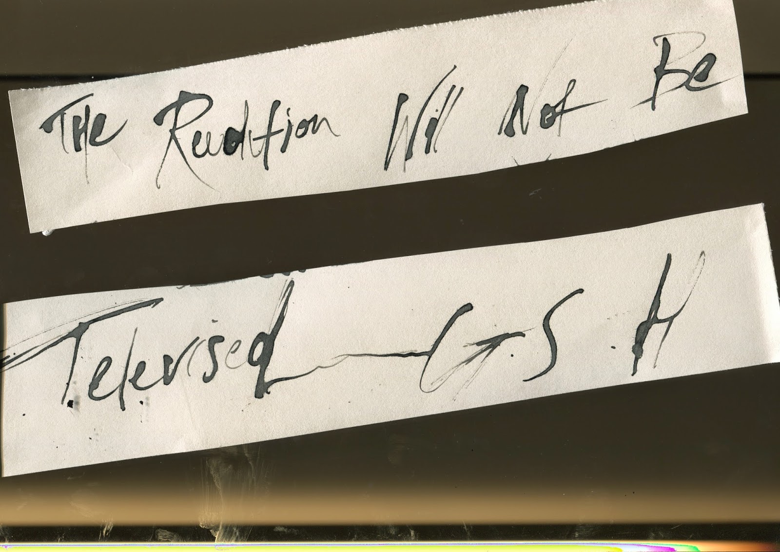
Looks a little lacking so there may be some editing to do yet but I didn't want anything to take away from the quote and the piano because that's all i'm trying to say. Gil Scot Heron even in his own opinion is a piano player and that's enough.

I went back and forth from using colour or keeping it white, white was far to stark and intense, it's always fighting with the black so I decided on a light brown it's neutral doesn't take anything away and compliments the image. There's a lot of improvements I could make, the shadow doesn't quite sit right and everything almost looks a little lost but i'm running out of time.


Vector.


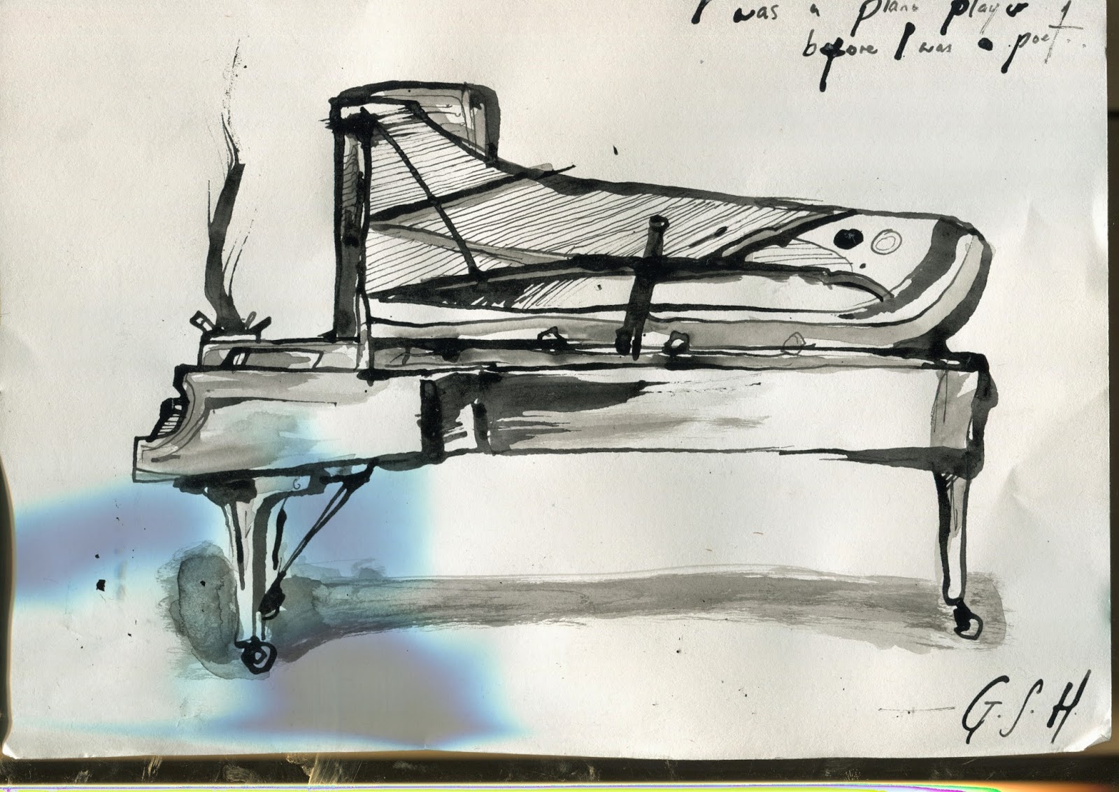
Took my favourite piano and made it a vector so I can blow it up big as I want, I think I'm going to do this for the rest of my project too, mainly to save time however.
I was at first going to keep the grey wash in the vector but after a lot of playing around I decided I prefer it with just the black lines.


P-P-P-PIANO


Loads of pianos, all of them took ages and I'll be honest drawing pianos is pretty boring; I'm ok never doing that again. Ever. After tinkering with pattern and line, I realised it was the composition that wasn't capturing the piano enough. So I did a bit more research and came out with the final two, which in my opinion are the most interesting.


PIANO

Had the epiphany earlier today that my favourite part of Gil's musical entourage is the piano playing and finding the quote 'I was a piano player before I was a poet' just made it all fit together, I want to use a piano and that quote as my main A2 size poster.
I drew this one and I liked it BUT

Think about tone, shape, line, value. There's more infomation that can be put into this, move the microphone stand around. Do this 4/5 more times.

(4/5?!)

DEADDEADDEADDEADDEADLINE

';
So here we are, deadlines nearly here and I'm still scratching my head. Then I was looking through old scraps for ideas and I saw these two and they work. For a basic point. An I think now I just need to choose simple imagery; my imagery and make it work with the songs I'm enjoying; here we go.


Panic mode

Deadlines approached, I've not done enough and my ideas have dried up.
Nothing is doing what I want and I don't even know what it is I want.
Nothing I've drawn is making me feel like his music does or even putting it across in a way I want it to. I'm in panic mode and I'm grasping at straws.
Cut an

Cut and stick could save my life yet again. Since drawing isn't working, I've decided to take important elements of his life and put them together in a kinda of homage to the man behind the music.

Crit (ASKING FOR HELP): The idea works but it's a bit too everywhere and it's almost like you've given up on your ability to draw, It's almost distracting from him. I don't know, I think you need to go back to bare bones of this and draw again. That's where you're strongest.

Did that help? I don't know if that helped. Guess I better get drawing...


AARGH


I'm getting far to envelopted in research and almost redundant facts now and It's distracting me from just drawing and It's taken me a few weeks to notice this and now I'm a bit bummed so here's a drawing or two.
(above)
Gil in his older age playing a piano with a back drop of a Bronx ghetto; I wanted to combine two very different parts of his life. If no colour is to be added it need more line; think about shape; patten; tone and value


ll
I went back to an older piece people seemed to like, My interpretation of one of G.S.H's most powerful songs in m opinion. 'Pieces of a man' this is easily the strongest piece I've done so far and I think I need to so more of this. Neaten it up; use strong values; Keep the text and song name; make it more realistic?
A finished piece of this may be used as my A2 size poster of maybe a postcard.


Looking back.

Going back to crit I saw two other good avenues to go down.
One was to listen to his work and relate.
Now a lot of his spoken word is aimed at people in the ghetto and the black community. I'm in neither of those situations so I'm not going to fake it.
The other option was to listen to his music and keep drawing almost your interpretation of it which is almost the same idea but It opens more avenues I think I need to look at an almost more mainstream Gil.


After listening to alot of his music again I got told to listen to the things he did with JamieXX they're 'more modern' and it 'might help you get a more overall feel'

Now don't get me wrong, It's not bad and it's definitely got Gil's touch but to me, this isn't where I'm taking it. It doesn't scream Gil Scot Heron at me, and I just don't think it's what I'm trying to say.
 

More Gil.


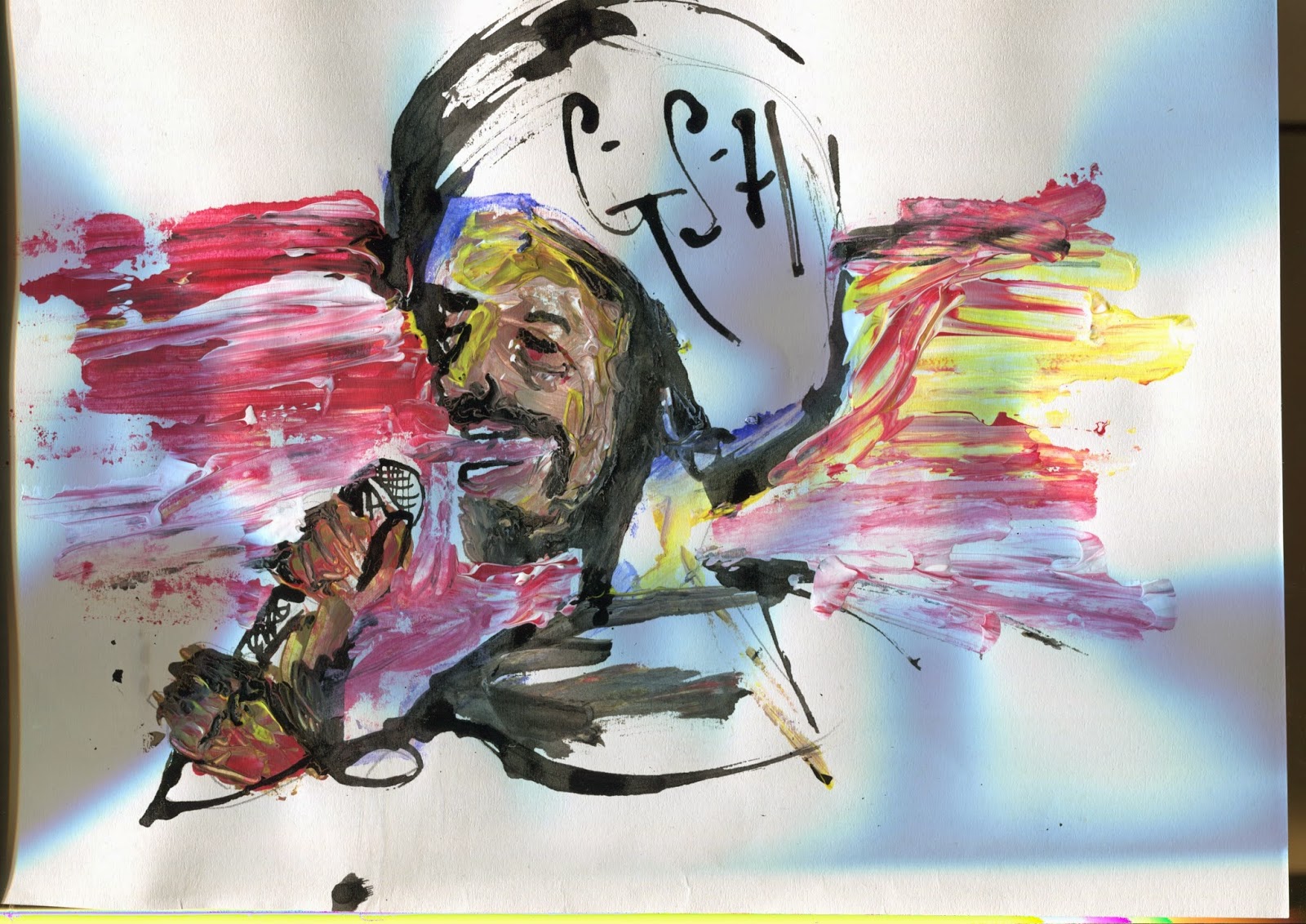
Colour: I thought since jazz and soul are quite fluid and emotional forms of music I wanted to see how I could use colour but after and few studies and the final one above, To me it takes away from the figure and the message I'm putting across, I might come back to it

Two steps back
My final studies of Gil are the ones in B&W above and after it, I decided this isn't the right to take this project, for me. Anyone could draw him and put a poster up and say that's him but it's not how I work and honestly; the way I work it's almost the easy way out and least creative. I need to get more involved in the subject.

FIRST CRIT?! and after

Already?
Ok, ok I may not have been working on this as much as I could and it's going to show.

Proposed my idea of 'Just wanting to show him off' and 'Just let people know who he is'

Basically I got told the idea is good but I need to do a lot more artwork.
Suggested ideas:
  • Keep going until you find something that feels right
  • Draw him
  • What he said
  • Find words and lyrics you can relate to
  • Expand and your interpretations of his songs
So I went right to a computer looked for images of Gil and decided I'm going to try and draw him. Seems the best may to almost advertise him.


A few starter Ideas, mainly focusing around his and his noticeable qualities.
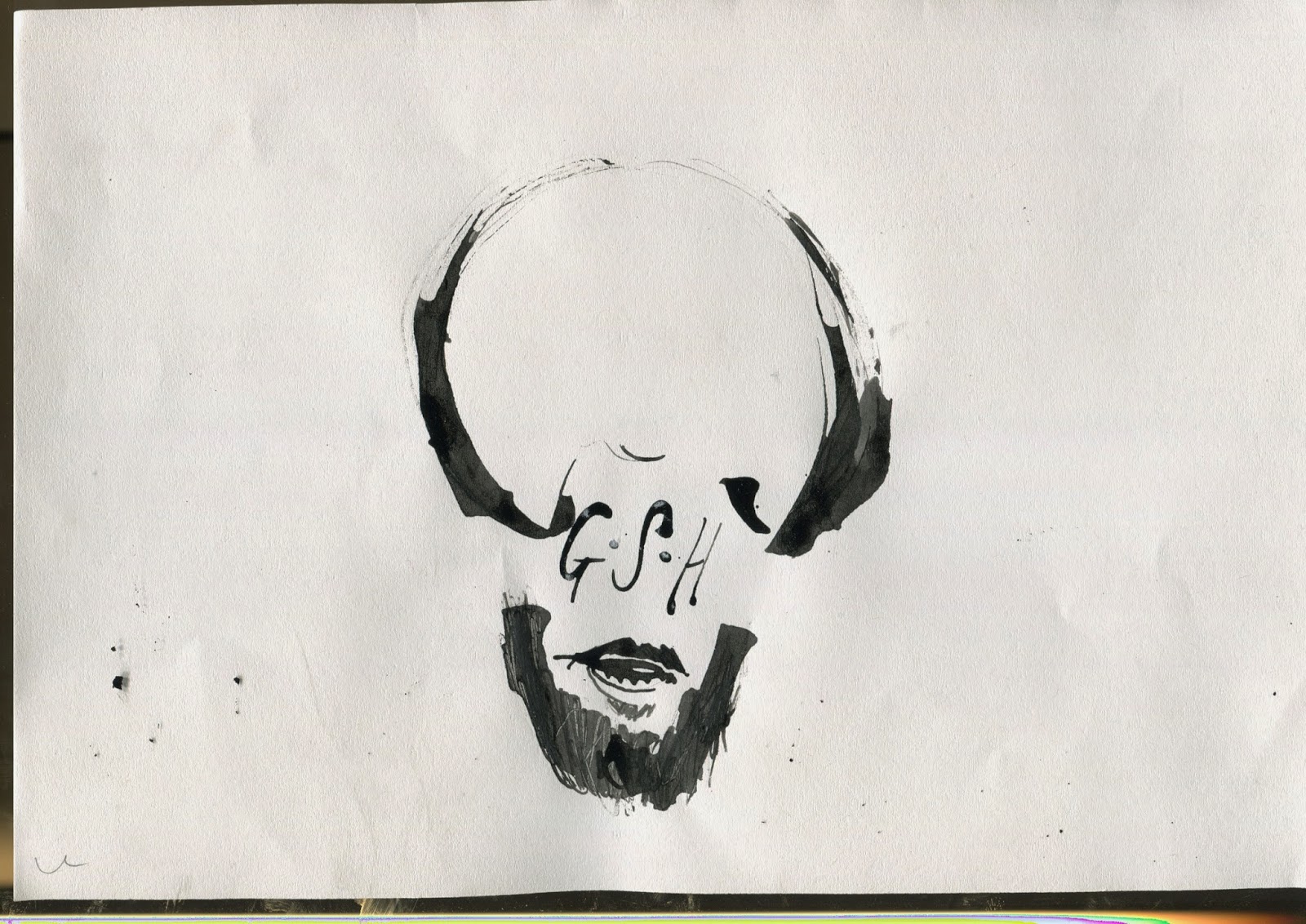
After drawing him a lot I noticed if you get the afro and beard right, you're more than half way there. So I wanted to see what minimal information I could use to make him look recognizable.
Might use that Idea for the stamps

First Idea.

I've decided I do not want to in anyway highlight Gil's addiction and other unfortunate things to happen to him, he was a great man and I think my main intention is to just create someone about so people will want to know who he was, seen as I'm pretty annoyed that I already didn't know this man.

So I just started with what first images came to mind of him:
    

Small doodles of images I relate to him; his name; smoking; his face; his background. All simple not exactly exciting things but it's a starting point as of now.

 
This to me is a little more interesting, I was listening to his music and a song 'Pieces of man' came on, a powerful song and it just decided to draw what my interpretation of feeling was towards that song.