Showing posts with label OUIL403 Photoshop. Show all posts

Monday, 11 November 2013

Photoshop Final


they look very simple but from practising on other drawings in photoshop it seems to work best and compliments the original artwork rather than working into the original too much.


Experiment:

The space one looked a little empty compared to the others seen as the original image uses a frame much more than the others, so i decided to just take a suitable background and add it it. I think it works for the image alone but doesn't fit with the rest of the set.


Monday, 4 November 2013

IM TRYING TO GET PHOTOSHOP TO WORK WITH MY TONE OF DRAWING!

ITS NOT WORKING!!!!!!


I just couldn't really figure much to do so I just decided to think I was ironic and make them look like they were made in powerpoint.


EDIT: IT'S SORT'A WORKING!!!!


Took this bat sketch I did out of my sketch book just to get better and learn what works with my imagery best before I go and work on the actual task at hand. I kinda like it, the ropey neon pink seems to compliment the image and just make it more weird.


  • Selection Tool - Magic Wand; Lasso
  • Layering same image on top
  • Hue/Saturation
  • Levels
  • Layer Option - Multiply


Tuesday, 29 October 2013

Experimenting


Bit more messing around with photoshop with this image, some of the images work, but not as final pieces. I found it pretty hard to get a finished look from the piece due to the sketchyness of my image and my inadequence with photoshop. I like how some of them look but in future I will either produce or go for a image more suited to my skill base.

EDIT:
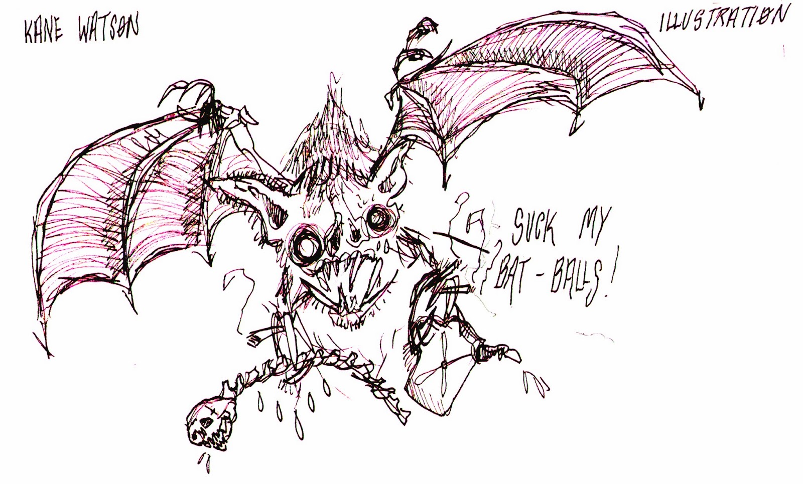
Found and old drawing of mine online and thought it looked like it could easily be manipulated and just wanted to quick go round to see if i can use what i've learnt on something else.


From this image I wanted to create a new image from the previous drawings on this page. Only a quick exerisize but it's always worth experimenting. So I cropped and cleaned up certain parts of this drawing to create a smaller, more digital drawing.
 

One was simply created by cropped, moving and cleaning up part of the other images then merging them together, Also taken the letters from 'FREEDOM' I created the word 'DOOM' I thought adding colour would make it more interesting but in the end i found the black and white image is much more efficient and the colour palette lends itself much more to the feel of the illustration.


Photoshop stuff


2nd week of photoshop tutorials. Today we learned how to mask; layer; colour and use our selection tools again from last week. Through importing textures; playing around with layer filters and the opacity of the layers you can radically transform any illustration. I also cleaned up a new image today because i felt It has much more potential then my pervious scanned image and it also helped my remember what I learned in photoshop last week. I'm still undecided about photoshop in my work as of yet, it's a useful tool and no doubt should it be overlooked but I still feel like i prefer more tangible materials.