Showing posts with label 603SB4-BRAND. Show all posts
Showing posts with label 603SB4-BRAND. Show all posts
Thursday, 19 May 2016
Tuesday, 17 May 2016
LABELs


This is the journey my labels have taken, all in one post to save space. They would be attached with string to my merchandise (t-shirts, jumpers, jackets) they started off on paper but I instantly realized it wasn't a strong enough material and switched to a thicker card. I believe doing it adds more value to the brand, it's not something someone will purchase but it gives a lot more weight to the product and therefore the brand image.
At first i started with a ultra vibrant and colourful label but i quickly changed that, thinking it was too garish and in you face, and the design gets a little lost. A lot for my work is garish and in your face but the work speaks for itself in that respect I think adding it onto the label is just a little bit try hard, and a stark black and white label stands out more clearly.
POSTAGE AND STICKERS, CLEANER IMAGES
These are just much cleaner image from the previous post.
It looks more professional and are much easier to make out.
It looks more professional and are much easier to make out.


Monday, 16 May 2016
POSTAGE POWERPACK


I printed my montage design onto different size envelopes, Its just adding more to my brand image. I think it's important to have as much branded as I could, these will be used for posting out zines; booklets and sticker packs to people, that was as soon as it arrives they know it's from GRIMGUTS and it's just a lot more interesting that a normal letter. I printed them a few times to get the size right, at first I thought the better the better but smaller looks more concentrated and it leaves room to add peoples postage address' and stamps.
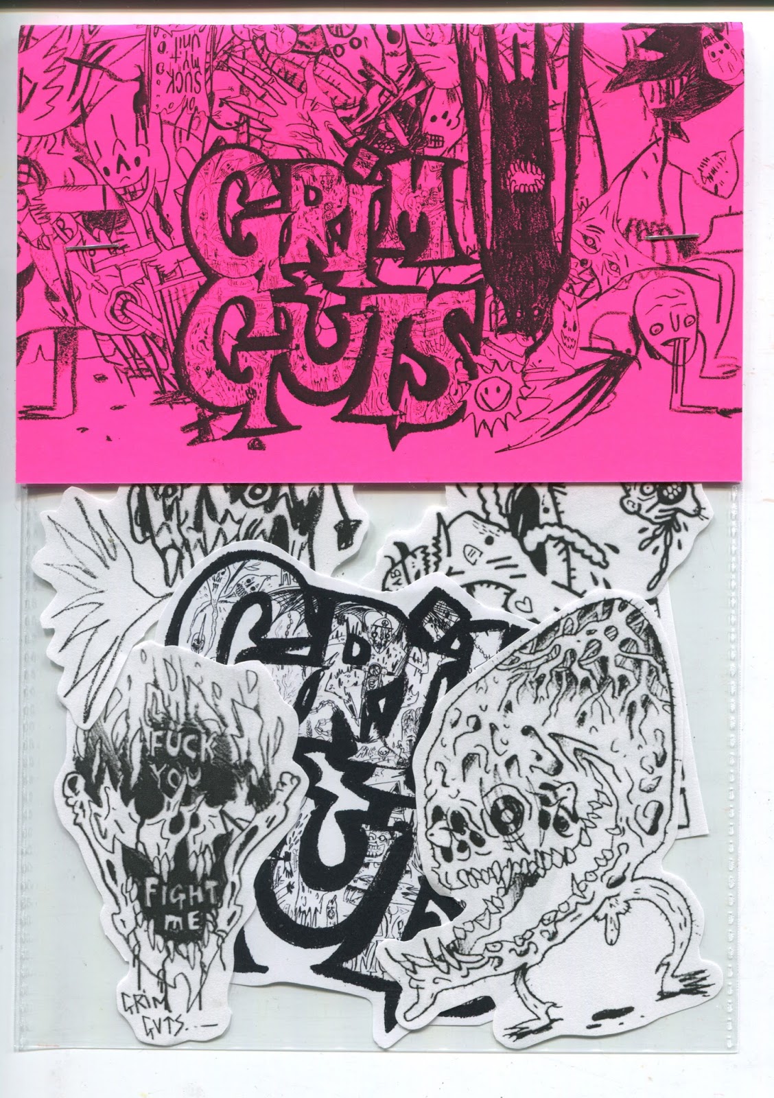
STICKER PACKS


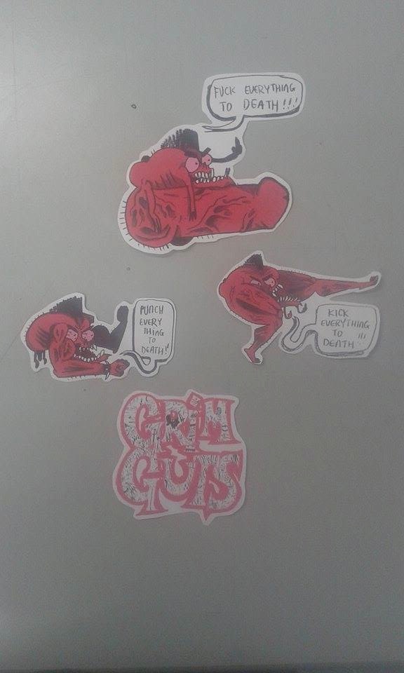

MADE SOME STICKER PACKS
It would of been easy to just throw these in a bag and leave it at that but I think when receiving something like this it should be an experience almost. The stickers should come in a branded envelope and then in a branded packet.
I feel it makes my work look much more professional and makes my brand not only look like the real deal but it allows people to be more invested in my brand, it looks more like a brand who cares about who buys from it. In doing so prompting customers to buy more from me.
The envelopes are also sealed with card which just makes the product feel more robust.
MONEYMONEYMONEY
'STICKER PACKSSS'


I orniganlly did the montage image to put onto envelopes and also it's a summary of GRIMGUTS so far, you get everything you need to know from that image. I had to switch it up slightly however. Since im in the process of making sticker packs the card will be folded over to half of it has to be upside down so when it's folded it becomes the right way round, it's only a little thing but it needs to be considered.
'STICKER PACKS'
Im putting together some sticker packs for the branding part of my brief since from my research I saw sticketrs and sold by a loit of skate brands, its a great way to advertise and it's also something that is within my reach to fully create myself from scratch.
I'm using my new logo i've designed as well as some of my favourite stand alone images i've made so far, ones that I think cover GRIMGUTS and PLAYNICE well as a whole.
I'm using my new logo i've designed as well as some of my favourite stand alone images i've made so far, ones that I think cover GRIMGUTS and PLAYNICE well as a whole.


NEW LOGO
There wasn't really anything wrong with my old logo on my business cards but since I've created a lot of new work recently and just felt like I wanted a little revamp, I made it much more quirky as opposed to the more robust logo I had earlier and employed two of the big sheets I've been doing into the text. Did a black and white image and a coloured one depending on what I would be using them for.


Thursday, 12 May 2016
BAD TIMES INTO BETTER TIMES

I mocked a skateboard up with some spaghetti but I think it works as a funny gimmick. it looks a bit like guts and gore but it remains good viewing for everyone but it took sometime to get right. The top image is just off. It's just dull looking, the actual skateboard mock up looks like and all condensed, there's too much going on too close together, the colours don't work with each other or the background, all together its a mess that doesn't work and isn't dynamic.
The image below the actual skateboard looks a lot smoother and cleaner, a more refined image with less going on which gives more punch to the chosen design, the background has then been coloured based around the board design to the whole sale display looks more engaging and easier on the eyes.

QUICK STORE MOCKS


I took some designs I've previously posted and put them up in two different retail stores, The first is a skate shop interoor which I think is made much more interesting with a 12 foot monster looking over the shoppers, I think something like this just makes the whole experience more engrossing.
The second is more closed based store with white walls, I think the contrast of the white to the red of the monsters is something interesting, also these monsters let shoppers know what kind of clothes they'll be looking at before they even look at them. If there's a huge buff monster on the wall its doubtful you'll be buying primark brand t-shirts.
PLAYNICE POSTER?


I did these little monsters just for fun but they went down really well in the studio and on instagram so by popular demand it just seemed stupid not to make a poster out of them if they went down so well. The important part from this isn't really the design or why I drew its more than I've noticed my audience and potential audience engaging in a design and I built on it.
Wednesday, 11 May 2016
PNICE - SPAGHETTI MOCK UP


Painted those two characters very loosely in a sketchbook, after seeing Elements characters skate decks I wanted to make one with a character on it as well and I wanted to have some play with wet media again and made these two monsters. Once scanned I chose my favourite one and realised I want to create a much more vibrant and coloured almost 80s feel design, so I played with the design until I got what you see about.

After mocking him onto a skateboard and playing around with the placing so too much wasn't covered by the trucks and wheels we get this. I'm actually really happy with it, i think if it was an official skateboard it would stand out in a shop and hopefully attract people who like Spitfire or KROOKED skate designs. I wanted to make it look a little more interesting if you were surfing the web and wanted a gimmick so decided to put them in front of some spaghetti for no other reason than it would make people look, It looks good and it's a little gimmick which adds more to to design as a whole. PLAY NICE is my work under the brand of GRIMGUTS so i've given myself a lot of leg room to play around and be weird, so it'd just rude if I didn't experiment more.

As i afterthought I made this little repeat pattern, the reason for it would be when a skateboard is purchased and has to be shipped and wrapped this design could be printed on rice paper or tissue paper and go along with to, too add more personality to receiving the skateboard as opposed to bland packaging.
THRASHERMAGAZINE // SPITFIREWHEELS
I decided to put these two together because what made them important and me want to put them up runs across both. Thrasher is first and for most a magazine, that's how they started and Spitfire was first and foremost solely wheels. They're both very popular brands and fall on the blurred line of popular underground. They're both a little more anarchic and gritty brands than say Element, which is why I like them.
Thrasher does have merch, not lots like others but still a wide selection. Thrasher has one of the coolest and most recognised logos in skateboarding so as you can imagine most their products consist of that imagery, hats/ t-shirts and hoodies yet again. So basically I need to mock some hoodies and hats up.
Spitfire have a lot more merch because they do a lot of collocations and topical off shoots of their wheels. which shows that even big brands still need to have there fingers on whats going on in their industry as opposed to shaping it themselves. Spitfire also do a lighter, which is very cool.
Both these brands push video as well, now all the skate brands i've looked at have videos but with Thrasher and Spitfire it's the first thing you see when you go onto their websites, and all throughout it. It's still about the craft and the passion of the sport and now just selling skateboards which isn't really much for my in terms of branding and making work I did however think it was important. It's about being together and looking after your own, with a sense of community.
ELEMENT
a little bit more skate product research. Element is a very popular skate brand, they encompass all parts of skate boarding and also branch into being an outdoor type branch. The main difference i've seen is the range they do, it's a lot more than previous brands I've looked at and also bags, They make lots of bags and lots of different styles and designers which a lot of other skate brands I've seen don't do much of. Then again there's lots of hats and t-shirts which seem to be the bread and butter currently, I need to start looking into hats, mocking them up anyway. I can never afford to get hats; bags; t-shirts; jumpers printed but I can mock them all up so at least it shows I've thought it through.
The latest skateboards they've realised i found interesting it's 6 different colours and characters. I just thought it was interesting that it was a very character based realise, you don't seen that much. Not as a set anyway, they're normally one offs. It's good for me though since it shows that character is relevant and I'm predominantly character based in my illustrations.
Monday, 2 May 2016
LEATHER JACKETS // PLAY NICE


EDITEDITEDIT
I've no more room in my posts now so I'll have to add it here this relates to these posts further along in my blog.
1. Spaghetti boards
2. Jacket Labels
3. Failed spaghetti skateboard mock


I got my jacket properly photographed and when I got the photos back I edited them to fit the theme oif the rest of my branding with spaghetti and vivid colours to make them look like much more of a collection and that they belong to PLAY NICE as opposed to just stand alone jackets.
I think the ones I did for COP worked much better, or I at-least preferred a more gritty/urban outcome but that kind of approach would not fit with what i'm going for this brief.
TAGS AND BAGS


It wasn't enough to just create a mock-up t-shirts, Too be substantial enough I had to consider a more 'shopping/retail experience' a lot of stores have personalized bags to take away once you spend enough of products in store and a lot of brands have labels and lapels attached to the products so I decided I'd mock both those ideas up too see how they would look at fit with the current look 'PLAY NICE' is starting to shape up to be.
SKATE RESEARCH
I've decided that 'PLAY NICE' and my branding is going to be influenced by the skating sub-culture and mainly aimed at individuals interested in skating and other extreme sports. So here's a post from PPP again which was research into skate boards
PLAY NICE
After looking at a few skate shops I wanted to mock up a skateboard design, I think it would fit in my portfolio well, especially if this is an avenue I'm wanting to go down.


Another great thing is that because it's such a huge industry there's loads of brands that might decide to one day pay me to make things for them.


It appears most decks are heavily graphic based, and seem to either be super bright colours of stark black and white, which would be to stand out I imagine, So with this in mine I threw some of my work on some decks.

I wanted to take my research into account to also remember to do my own thing, If you copy everyone else you'll just lost within the people you've copied so with that in mine. I did one hyper colourful image with a repeat patten and my PLAYNICE logo pasted over it and then a character of mine on the other. I chose to keep PLAYNICE and GRIMGUTS small seen as if it was officially on a deck it would be a very new brand so the artwork needs to speak more than the gravity the name holds. Brands like HAWK and ZOO YORK can be sold with just the name because of the mass following they have, and people are paying for the name above anything else.
Another great thing is that because it's such a huge industry there's loads of brands that might decide to one day pay me to make things for them.

PLAY NICE
A lot of my PPP work runs along side my studio practice briefs as well so i'll be pulling some posts from my PPP blog to use on this studio practice blog as-well.


PLAYNICE was a concept that was accidentally born out of one of my sketchbook rambling and I don't know I just really liked how it sounded and I think it works well with the Juxtapose of my practice and the fact, nothing i draw plays nice. So i decided to adopt this for a little bit to see how it works and to work it into my brand.


so far, on these tshirts anyway. I think the concept works really well and if i continue to work towards this could be an interesting side to my current GRIMGUTS brand, play nice would fall under the umbrella of GRIMGUTS which means in the future there could be even more things under the broken umbrella that is my name.
Subscribe to:
Posts (Atom)