Monday, 18 November 2013

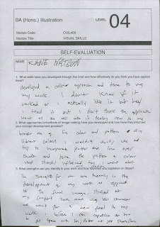
OUIL403 End Of Module Self Evaluation.


Through this brief I have developed new approached and techniques in applying media I have already used in different ways as well as a better understanding on collage/ mixed media and a aspect of how a digital process can help improve my work. They have all been applied strongly in my development work to help me generate new ways of thinking and better ways of producing different ideas. However they could be used more evidently in my final pieces as opposed to mainly my development work.
         I used collage, cutting and sticking from images on the web, in magazines and photos taken myself which I haven't done before as well as using unusual tools to create line such as a toothbrush; empty biro; straw; blunt end of a paintbrush and a knife. All producing lines and images that outcomes would not of been as interesting if I had approached it with traditional drawing tools.
          From looking through my body of work and knowing my own personal practice my strength seems to lie in the speed and fluidity in which I can produce ideas and keep producing ideas, which at the beginning of briefs gives me a much deeper breadth of scamps and answers I can use to inform the rest of my work.
          On the other hand however It is also a big weakness of mine that I find it very difficult to slow down or work on ideas over a long period of time, this includes idea generation and final pieces. Which in turn can have a consequences on my final pieces making them looking unfinished and not throughout even if it has been. From this analysis I must adapt my process and how I work and start to slow down, considering lines and media more and try harder to focus on a more studied image(s)

5 things to think about doing differently

  1. Spend longer on final pieces
  2. Broaden media range
  3. Analyse Thought process 
  4. Application of media
  5. Working digitally
What can i I expect to gain from each of these things? 


  1. Trying to slow down my process on final pieces and make more considered decisions about them will in turn give a more finished off almost professional look to my final outcomes.
  2. I tend to stick to Inks and free flowing media, especially water colour because I know it's loose and It works well with how I work and my tone of voice however constantly trying new media and forcing my self to use alien media will help me evolve as a illustrator and could open new paths of working I would not of come across other wise.
  3. Analysing my thought process more after producing images and though-out producing them will allow me to really look at whats working and what isn't and will positively effect every decision from there on
  4. Even though I feel I am trying new ways to apply and experiment with media I've had some strong outcomes from this and would like to pursue it will as much determination as I have been so further my process and artist utility belt
  5. I've only worked digitally twice ever really and that was for studio brief 1&4 and even though it's not something I instantly feel a connection with or even see it as a way I enjoy working, I nonetheless understand It is a crucial skill to learn and cannot ignore it.


Thursday, 14 November 2013

Final Image


Self eval:
Pro:
  • Considered type of line
  • It looks like my work
  • Considered use of colour
  • First attempt at digital work
Cons:
  • Boring image
  • Not well scanned in
  • Quote not put across strong enough
I now need to split it into 3 600mm x 300x pieces so It can be printed out then reassembled to it be larger than A3 and not in an a format to meet the requirements of the brief.

EDIT:
After tutor feedback and self consideration, I went against spilling the piece then reassembling it and instead went on to create 3 similar yet separate illustrations from the same starting image.


Final, Whats going on?


  • Been figuring the best ways to work on final piece
  • Practising with different media
  • Started with digital work
  • Compostion
Going Digital

  • Branching out of comfort zone
  • Trying to produce my tone of voice across a digital media
  • Out of all tried medias digital works best for this project
Progress shots:

  • Small brushes - Find it executes my 'style' much better across a digital interface
  • Colour, White - Stands out much better than previous colours tried: Red; black; yellow;green


Monday, 11 November 2013

Photoshop Final


they look very simple but from practising on other drawings in photoshop it seems to work best and compliments the original artwork rather than working into the original too much.


Experiment:

The space one looked a little empty compared to the others seen as the original image uses a frame much more than the others, so i decided to just take a suitable background and add it it. I think it works for the image alone but doesn't fit with the rest of the set.


Getting more serious(ish)

Taking things from around me, and editing them as such with my own opinion on how I see things, based on the ideas generated from last blog post.


  • Experimenting with more media
  • Layout
  • Composition
  • Text
Can't decide if the masking tape works or not, will have to keep trying it out.
I didn't really want to use text much in this project but the way its going It could help the image.

EDIT:

The top image, Is something I really like with just the bastardization of the ink over the original image, so for my final piece I want to combine both the cut and stick aspect I've been working with, with my own lines over the top. 


More finalised ideas.


So this is whats it's come too so far. Felt like moving on from the ads inside the magazine the the actual cover could create some interesting results. 

I think they work well together and by using another texture for the background it means my image isn't fighting with the white background all the time.

Here are some more examples from ads across a scale I thought worked out well:


Top:
  • Larger scale
  • Drawing into image
  • Adding own 'text'

Bottom:
These were more by accident, I decided working into the images with fine liner could work out quite nicely and allow me to 'edit' certain things. An the bottom two images almost have my own opinion on the picture at hand and how I see things.

Left ' You're all overpaid'  Right: 'Im gonna beat this animal until i get money'

Cutting and sticking?!


Instead of just browsing the internet, I used to library to get, magazines across the board of diverse media and start scanning in reference imagery.

The one above is my favourite out of the ones i produced simply because I think it's funny and the whole imagery just fits together.

STEP IT UP


Combined images from the internet, scanned pictures and images cut out from magazines I've gone and got myself. Just experimenting still. Getting a better idea of how my final images could come together.

  • I tried to add the models eyes back over the bats face but I don't like it, won't be doing it again.


What have I been working on?


  • Mixed Media
  • Experimenting
  • Tone of voice through new development


Start off with sketch book developments. Media, I went for Miley Cyrus since she's everywhere and just added a comical satire to one of her recent publicity stunts, then moving onto taking images of cat walk models.


Developing Ideas

After choosing my quote, and taking my stronger concepts of masks. I decided to talk a less literal approach to 'masks' I got the idea of celebrities; Politicians just the media in general. How things are portrayed and my opinion towards them. I just needed to go with it and just start making and hoped my tone of voice would come through just from working, SO:

BATS


MEDIA:


What!?
  • Images of celebrities/ models etc taken from google
  • Bats as a base for my tone of voice (It'll make sense)
  • I decided to work with quick ideas as usual but not with Ink and Line like usual, I'm going out of my usual comfort zone and going with a more mixed media approach. 


Group Crit.

I had quite a busy week with other things so this project got off to a slow start for me and by the time the group crit came around I still hadn't solidified and Idea in my head of what I wanted to do. So i was hoping that this crit would help me out.

Pros

  • Strong starting concepts
  • Planning ahead for 3 pieces
  • Early consideration of formats
  • Consistant concepts 
  • Diverse Ideas
  • Good use of narrative and sequence 
Suggestions

  • Start expanding on ideas
  • Work with a comic format
  • Play to your strengths
  • Experiment with media and colour
  • Settle on a quote 
We all had a group chat, discussing my strongest Ideas and concepts (Masks, Narrative, Demons) and it helped me decide the quote I'm doing is:

2.   We don’t see things as they areWe see them as we are. - Anais Nin


How to get started?


No quote really jumped out at me, dramatically so after some deliberation. I just started drawing, sketching doodling and when I felt warmed up I decided to just go down the quote list and draw the first thing I thought of for each one until I found something that fit. Working across 3 A2 pieces of paper.

it quickly became apparent that the majority of quotes, for me personally would dry up quickly idea wise, or just didn't engage me enough to form strong personal opinions on. In the end the main quotes that stuck out to me where:

  • Fail. Fail Again. Fail Better.
  • We don't see things as they are, We see them as we are
  • We are what we repeatedly Do


OUIL403 Studio Brief 4

Produce three none A format Illustrations that visually communicate your response to chose quote.
Explore one of the following:

  • Image as communication
  • Type and image
  • Type as image
Deliverables:

  • 3 x Illustrations
  • Any scale
  • Any Media
  • Cannot be standard A format
Deadline: Friday 15th November

Quotes:


1.   Fail. Fail again. Fail better. - Samuel Beckett
2.   We don’t see things as they areWe see them as we are. - Anais Nin
3.   Style = Fart - Stefan Sagmeister
4.   The best designers can make music on any instrument - Anne Traver
5.   We are what we repeatedly do. - Aristotle 
6.   When I die, there is nobody to take my place - Keith Harring
7.   A drawing is simply a line going for a walk - Paul Klee
8.   Life is the art of drawing without an eraser - Unknown
9.   Creativity takes courage - Henry Matisse
10 . People ignore design that ignores people - Frank Chimero
11.  Culture used to be the opposite of commerce - Tibor Kalman
12.  Comics are a gateway drug to literacy - Art Spiegelman
13   Complex ideas can produce simple things. - Daniel Eatock
14   Ideas are one thing and what happens is another. - John Cage

Monday, 4 November 2013

IM TRYING TO GET PHOTOSHOP TO WORK WITH MY TONE OF DRAWING!

ITS NOT WORKING!!!!!!


I just couldn't really figure much to do so I just decided to think I was ironic and make them look like they were made in powerpoint.


EDIT: IT'S SORT'A WORKING!!!!


Took this bat sketch I did out of my sketch book just to get better and learn what works with my imagery best before I go and work on the actual task at hand. I kinda like it, the ropey neon pink seems to compliment the image and just make it more weird.


  • Selection Tool - Magic Wand; Lasso
  • Layering same image on top
  • Hue/Saturation
  • Levels
  • Layer Option - Multiply


Final Feedback-Studio Brief 3

Peer Feedback Pros

  • Lots of Ideas, good use of visual thinking
  • Good range of ideas in sketchbook
  • Lots of different methods of using Ink explored
  • Good use of varied brush strokes - works well with two colour rule
  • Explored a real range of different possibilities, very thorough
  • Powerful Imagery, extensive range
  • Well explored application of media
  • Digitally finishing work was a nice touch
  • Striking Images
  • Good use of continuous line/boarder
  • Good use of space
  • Hands in final landscape are powerful/Intimidating 
Suggestions

  • Developed more ideas further
  • Try taking more ideas out of the sketchbook
  • Tried a broader range of media to investigate relationship with subject
  • Tone down style
  • Consider theme of article
  • Developed more Ideas from initial idea generation
  • Broader range of media ; Charcoal pencil


Tutor Feedback:
Fred called me over just to quickly mention i should try using different coloured stock, so as though I'm not battling with the white paper all the time so my lines can be more subtle. Can't believe I haven't thought of that. I'm a ball-bag


Final-Studio Brief 3


Eval:


In short, I don't like it. I really don't like it.
Here's why:
  • Looks sloppy
  • Has an Unresolved feel too it
  • Bad use of negative space
However:
  • I developed a new way of working due to the development
  • I developed more ways to fill space with line as opposed to shade or tone
  • I know my work can be less 'crazy/weird/offensive' 


What am I trying to do? Studio Brief 3


Trying to get away from my really sketchy; almost evil and erratic style and try to produce a calmer image by trying a different tone; line; media and pattern.

WHAT YOU USE:
  • Vibrant colours
  • Pencil Crayons
  • Wash Ink
All applied in a calmer way, with a more delicate touch. Also tried to stay away from my usual characters since i think they create the anarchy in my work. So I won't be using the top left hand image for my final piece

DID IT WORK:

  • Style seems more playful
  • Tone of the image in quieter
  • None of the above mean I like it.

What happens when you do illustration an your flat mate likes takeaways?

COMING SOON

Idea generation, What have I done?! Studio Brief 3

Just had a quick idea to do lots of skulls saying typical bad boyfriend stuff and used a blue biro over my usual black to see if it effected the mood of the image or changed things in any way.


It didn't.