Tuesday, 25 February 2014

Illustrator Induction.

Using photo references of the cities we have chosen, We had to import said photos onto illustrator and then learn how to turn them into some kind of vector image.


Examples of vector images:


Instructions:
File > New > Check profiles >Disable fill colour


Monday, 24 February 2014

New Breif OUIL406 studio breif 2


Overview:
Choose 4 cities (major world cities) and create postcards for each.
120mm x 210mm
Pure image, no text.
Digital - Illustrator workshops

Consider:
Iconic imagery
What represents city; monuments; people; buildings
Extensive visual development; experimentation; thumbnails; scamps; colour tests etc

Initial Questions:
Can we use sketchbook sketches and convert them? yes
Can they not be major if we can represent them? yes
Can they be fictional cities? yes

Consider who the audience is, who would by this and who would receive it.

Initial reaction:
  

Make a point.
See past what city advertises, raise awareness.
City Ideas:
Pyongyang (N. Korea)
London
Iraq
Egypt
Palastine
Canada
Athens
Spain
Russia
Japan
(I'm aware a lot of those are contrys but a starting point)
Iraq: Sunni; Shi'a; Samarra; Civil war; Iraq war
Canada: Ottawa; Toronto; Rob Ford; Crack
Ukraine: Kiev square; civil war; riots
Spain: Madrid; Knife crime; Bull fighting
Hell


Here's some weird hands.


Group/Self Crit


Group Project Feedback:
FRED HATES EVERYONE
BECAUSE WE ALL SUCK, Is what I wrote with a little drawing because basically today we all messed up and didn't have the work (well actually our group did, but one for all and all that) and I'm aware that time management is a thing that is a bit of a hiccup of mine so, I understand were the tutors are coming from.

Collob Effectiveness:
- Good communication                                    -Problem solving well
-Good Group                                                   -Lots of artistic diversity
-All contributed one way or another                -We overcame obstacles quickly
-We all got really well                                      - We all worked really well together


Self Feedback:
  • Collaborated well with everyone in my group, I had a good group as well I like to think I brought something to the table
  • I'm quite erratic so I can generate Ideas quickly, not always efficiently but they happen. As well as doing more craft based things, making fake sick and whatnot
  • I feel my strongest non visual skill was just being able to explain ideas easier and get ideas out
  • As a group we all worked on things equally as opposed to one person doing specific things, accept for the end when some tasks were given out. Mine was too take photos, model and do set
  • Problem solving was a lot easier with all of us there, more minds and all that. Made everything into just a little bump in the road as opposed to road blocks.
  • I need to work a lot harder digitally, that went over to my team a lot more than it was left on me.


Final

Final A2 Poster:


Final Gif:


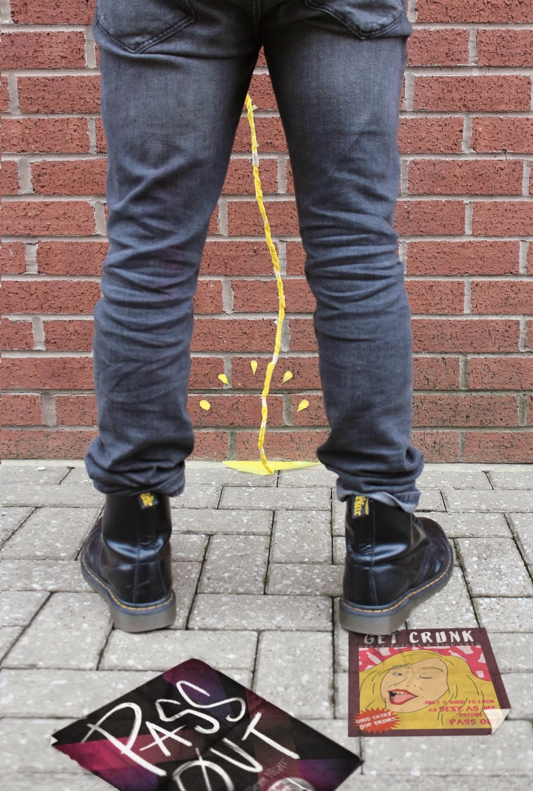
I think they both work pretty well, I'm glad we still got the use the pissing pictures and I think it works really well as a final image, we had to photoshop our mock flyers in there since it was an after thought but the power of the group pulled through.

After thought:
Just thought i'd mention we had a decision between the final photo we used and the one below and after discussing the top photo, even though photoshopped shows our mock flyers more and We all just decided works a lot better and it more clear.


Gif


Here are some quick thumbs a member of our group did based on the research beneath it, I was here for the brainstorming and help with ideas but as far as putting the gif together I was in the background I watched it happen and gave ideas buuut I can't get my head around it. It's kinda hard to step away but it was for the best of the group.

Gif:

EDIT:
After we watch it through we really felt it lacking so agree'd to meet up brainstorm and have some idea time:

To me this one just seems more playful, it's broken up easier so the people watching can take it in better and is just a huge improvement from earlier. Should also mention we took out the pissing part of the gif, it just made it look to long and cumbersome and didn't fit as-well with the others.


Photoshoot


Here's a small selection of about 200+ photos we took for the gif and for the final image, in the end for the gif we decided to do a kind of play by play or a night where 'someone' gets fat too drunk.
So after reading our stories, looking at facts and drawing from personal experience we decided the best 3 things to do were:
-Pissing inappropriately
-Getting into a fight
-Being sick
- Passing out.

Crit:
It proved difficult because we wanted to do lots of different things but it became clear quick it had to be a point of view sense as not to stereotype any type of people that dress a certain way
Pissing:
This was quite hard, we had to find the right stop and stick the tissue paper piss down and take photos then move it so i looks like it moved, we got weird looks but we sussed it.
Getting into a fight:
Not too hard to too, some drunken hands up and a fist coming towards the face, after the photos were taken we had to go back and edit out any sense of a person and just leave the fist
Being Sick:
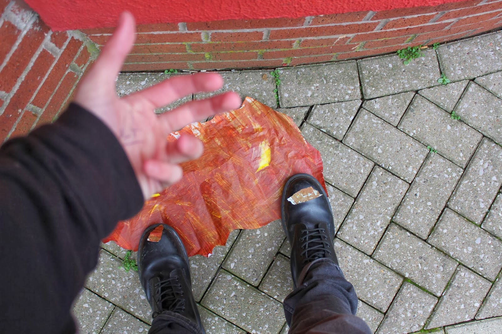
This was probably the hardest part of it, first it was going to outside a club then outside the house then we decided it would be best to be 'sick' in a toilet, then came getting the right shots with the tissue paper. It took the longest but I think it worked out in the end.

I learnt it takes a lot longer than you think to set up and take photos of a certain, it took 4 of us to get these right when before it's something I figured I could probably butt off on my own

Monday, 17 February 2014

Vis. L

Plan, design and produce a single image that includes you, an elephant and a butterfly.
Work with a frame and format of your own choosing.
Work only in monochrome.
Thumbs (x 8 minimum!) and resolved artwork need to be on the wall 10 mins before the end of the session.
There is reference material available. As always, how you draw (paint/make/construct) is up to you.

\This is an exercise in planning composition so please don’t worry about making detailed, highly refined artwork!


I really like that we got to do with in class, it added a deadline and time frame for me to do which i think make me worst faster and more efficiently than i usually would do. Had a but of time so did a bit of character design to make it seem a bit more like my work.
  

Composition wise I think i did a good job, could of probably done better but I got the effect I wanted the actual final image is pretty long. I tried to scan it and stitch it together to give you an idea.