Tuesday, 2 December 2014

P.P

Colour Splits.


Just to show an example of colour splits. If i print them both off digitally and expose them both on one screen I can create a two colour print. The bigger the screen the better because that way I would print all designs at once then cut them out myself instead of continuously re-exposing screens.

Split:

Split:


P.P


These are the smaller (A5) screenprint ideas i've been working on. Note these are only digital tests designed to give me some scope on what the end product may end up looking like. They're a little bit cleaner than I'd like, doesn't feel like my usual practice at all. It's good to try new things but i'm still shaky on the outcome


Plan

P.P
  • Decide on a simply cityscape, go with it
  • Choose 4-6 smaller characters to go around the print (2 colour print)
  • Use photoshop to scale everything properly then print it off digitally
  • Expose screens and start screen printing them.
  • 1 A2 two colour screenprint
  • 4-6 A5 two colour print
M.P
  • Keep it very simple
  • Choose mundane 'breaking points'
  • minimal movement
  • focus more on sound
  • find shortcuts for yourself
  • 3 stings showing everyday breaking points 
  • Equilibrium - Disequilibrium - Re-equilibrium


Animator currently looking at: 
Felix Colgrave, I think is my favorite animator ever. Which is a big thing to say considering he's not exactly well known or even really out of collage (America) everything he does just really resonates with me, It's just the right mix of weird but skillful that hits home with me. It's strange I find myself most drawn to digital animators when that's not at all like my practice, nor do I want it too be.

Surgery.

Questions - Printed Pictures

  1. Text, how can it be used?
    Text can be used as an image, not with an image. It should help create the image however it's not really relevant for you, and the amount of ideas you've already got going you're going to over complicated things for yourself.
  2. Over-Complicating things for myself?
    The scope of what you want to do is doable but there's still a lot to do. You're worry too much about the contextual side of things and constantly tweeking too much. You've already got a large body of work to go from, don't add more choices to that.
  3. Colours?
    Colours are important in this and your idea for having welcoming colours to a unwelcoming scene work well but it's something you're just going to have to do in order to see how it all works out
Questions - Moving Pictures
  1. How refined does it have to be?
    Refined as a finished product, fully. Don't think of that as it has to be a super crisy and clean animation. Just running with the very basic you can. Make it easy for yourself. Super 
  2. How relevant to the author?
    basic/minimal; almost abstract in a sense will work well with the ideas you're working with.
    As long as you show the journey you've made and why you've got there; as long as it was directly inspired by an authors text then it will be fine.
  3. Literal or inspired by?
    Inspired by

    Summary:
    Ideas are there, almost too many. Over thinking the concepts behind it all. You've got lots of ideas and you're trying to add too much too it. It can always be something you can come back too but as of now you're running out of time and the best thing for you to do now it make a plan and then just go do it.

Tuesday, 25 November 2014

P.P City

I'm aware the hardest task for me will be developing the city in which my charaacters will be expressing themselves. It's not something I usually do nevermind take on such a big job of it but I need to start somewhere. Here are examples of ideas of cities; views; angles and illustrations I've been looking at to give myself ideas.

P.P


More dynamic and refined versions of some characters I've been working on. I think the character development is in it's final stages now. That being said I will still be working on them a lot but i feel comfortable enough to let it calm down for the moment. This will allow me to focus on the rest of my piece.


P.P


Feel like i've got an proper idea to run with now. 'Viper City' is essentinally what i've called my fictional dystopia that I want to develop. Giving it a name also gives it more a grounding for me, maybe it's a mental thing. I want to create several recognizable characters or gangs to that interact with each other. So it's not just obviously 'people' messing each other up but almost monsters or distorted reflections at least. To be black and red looks the best for two colour but I don't want to fall into the niche of red and black for danger. I almost want to use a more welcoming/less dangerous colour than red so from a distance it looks inviting then to be given the reality of what it is you are viewing.


P.P Influences

I've come to realize how easily I am influenced and inspired by the general things I have in my life of even things I might be doing in my 'down time'

Now i'm not really one to watch a lot of T.V of play games however over the past few weeks I've been watching and playing certain types of games/t.v and it's effecting my work a lot and inspiring me some.

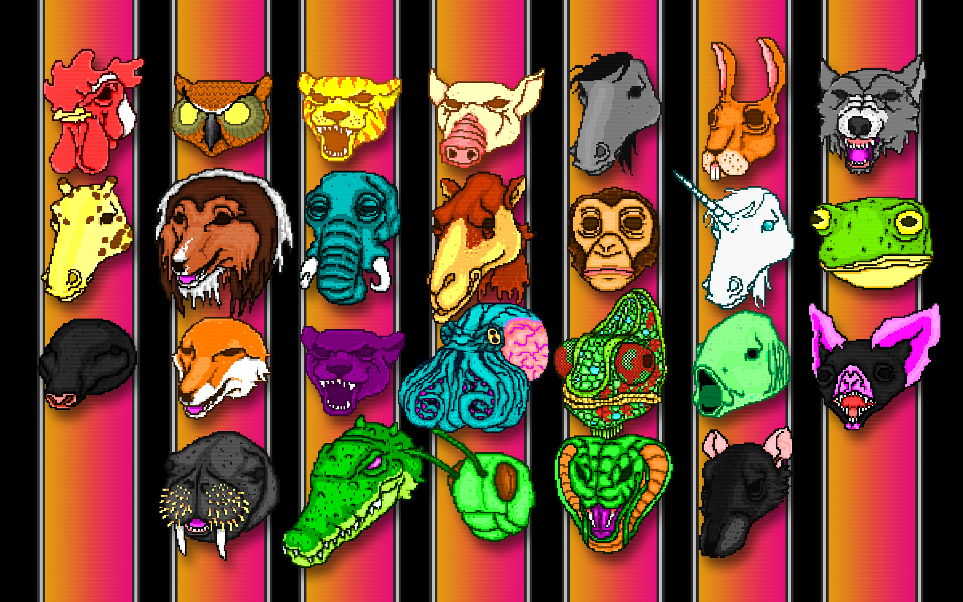
Hotline Miami


"Hotline Miami is a 2D top-down action video game by Dennaton Games, a team composed of Jonatan Söderström and Dennis Wedin. The game was published by Devolver Digital and released on October 23, 2012 for Microsoft Windows.[2] The game has been described by Eurogamer as "a top-down f***-'em-up",[3] blending top down perspective with stealth, extreme violence and surreal storytelling, along with a soundtrack and visuals influenced by 1980s culture."

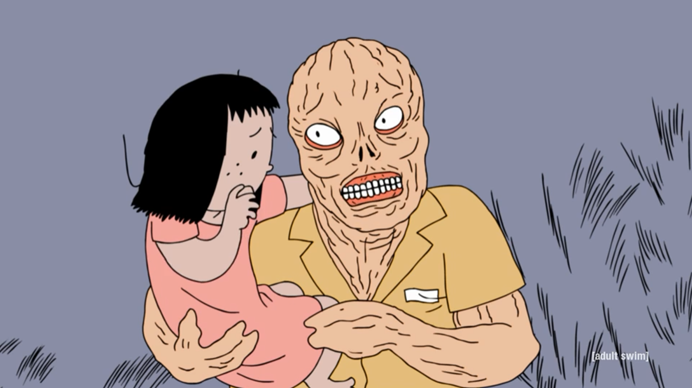
Ugly Americans


"Ugly Americans was an American animated sitcom created by Devin Clark and developed by David M. Stern. The program focuses on the life of Mark Lilly, a social worker employed by the Department of Integration, in an alternate reality version of New York City inhabited by monsters and other creatures."

Superjail


"Superjail! is characterized by its psychedelic shifts in setting and plot and extreme graphic violence, which give the series aTV-MA-V (for graphic violence, including scenes of bloodshed, dismemberment, torture, and extreme cruelty) rating.[5] These elements are depicted through highly elaborate animated sequences, which have been described as "baroque and complicated and hard to take in at a single viewing". [6]"


P.P


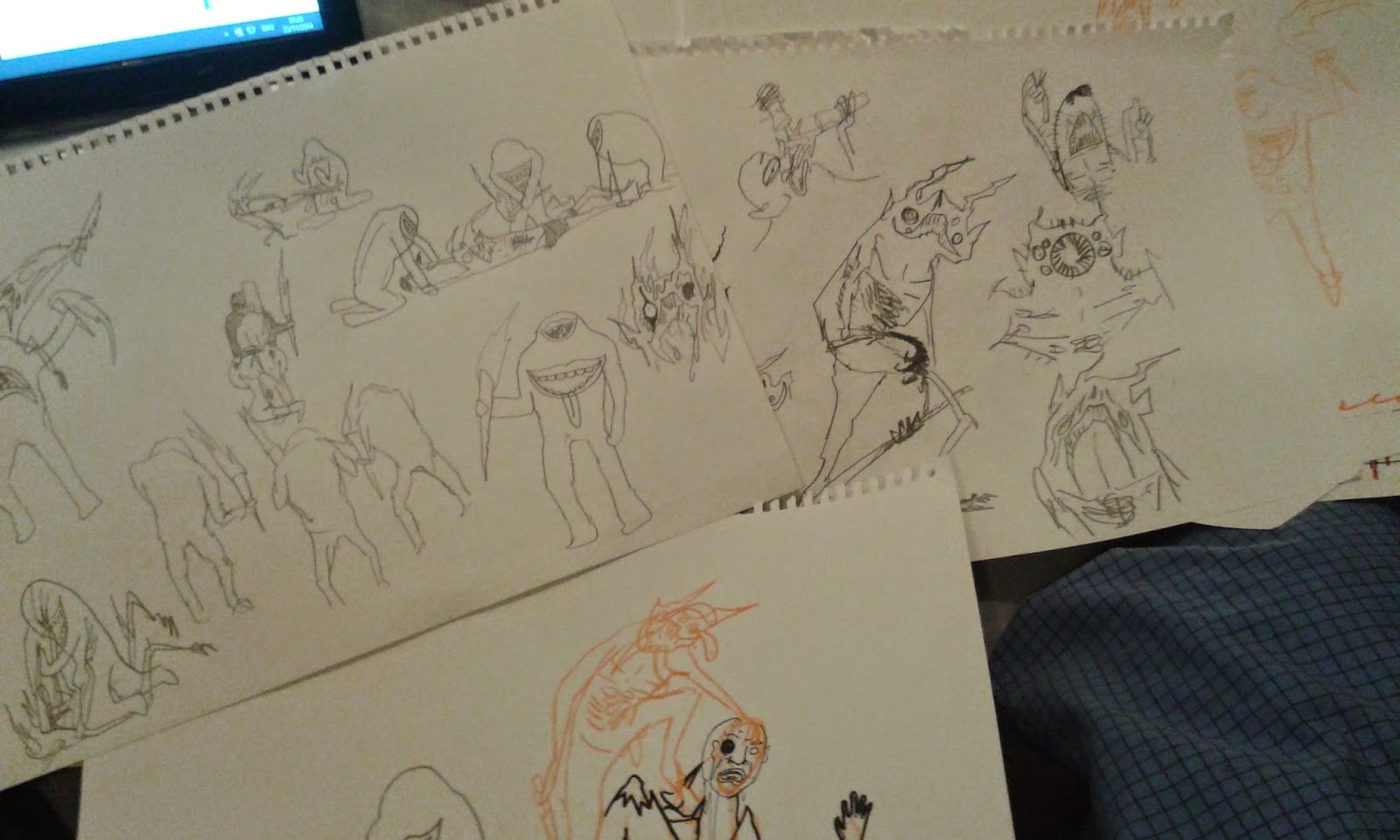
Some character doodles and ideas for my printed pictures project. Character is both fun and frustrating. I'm trying to not be restricted by my own practice but also not run along side working practitioners work too much that it just becomes a bastardization of their work.

Printed pictures continued.

Wanting to create a some what distopian/ultra violent/ gritty mirror of the world. I've decided to do that I have to look at character and my interpretation of social and cultural stand offs. I have found new inspiration in the following:

Main Influences 

Cleon Peterson:
Peterson's work is for me a stark look at the ugly truth. It's a ruthless depiction of the animalistic tendencies that society tries to hide; the people in power and the people who are meant to help you and just as ready to turn on you. It's simple and raw and primal. The two colour contrast really a punch to the image which Is a device I plan to use and it will also flow to screen printing easily.

Jack Teagle:

During a Big Heads session with Jack Teagle he described his work as containing a lot of '90's cartoon violence' which in short is fighting and characters getting hurt but it almost looks fun and in the end it looks like to no really gets hurt. Almost like actual fighting but without any of the gore. One of the main reasons Jack has helped me develop my idea is his unique design of characters which is something I'm trying to explore more


Wednesday, 19 November 2014

Questions to start a breif


1. Why have I chosen this brief?
Curious about how I can make my practice work with an unexpected brief choice for myself
2. What do you want to get out of this brief?
How to take on a real time competition brief; to see how far i can push the boundaries of my practice; to prove something to others and myself; See if i can make my current style fit with the brief in a real or even satirical sense
3. What do you need to produce in response to it?
'creative resource that will inspire and motivate our target audience of dads to read to their children for just 10 minutes every day.
The creative can take any form (for example print or online advertising, a video, infographic, an experiential movement etc), but it must leave audiences with an understanding of just how much of a difference 10 minutes a day reading with a child can make.'
4. What do you want to produce in response to it?
A fun alternative idea based around a several illustration prints.

1. Who is the audience?

2. Who should the audience be?
3. Who could the audience be?
4. Why?


Audience defined:

Intended audience
Actual Audience
Potential Audience

Audience Profile
What do that audience do?
Where do they go?
What do they buy?
What do they want to be?

De-bunking breifs.

Breaking down to the core of what a brief / company is saying in a brief.

Problem
People don't know about us
Fun not serious
Multiple audience
We don't know what we want
Pretty but pragmatic
We're dull and out of date
We want to add value to our product

Proposal
Produce a product
Produce a concept
Persuade through campaign
Innovative design
Update with ideas
Imaginative new ideas

Result
Publicize brand
Expand audience
Return customers
Attract kids
Edge of competition
More customers

10 things

Things To Get Out Of Responsive  

1. To work with professional clients 
2. To win!
3. To learn pitfalls, and mistakes
4.Extend portfolio
5. To gain practical skills in building professional design and pitch boards.
6. To make connections 
7. Make some money 
8. To learn how to manage professional briefs
9. To learn how to assess the quality of briefs

Group list

1. Broaden your approaches
2. WIN STUFF
3. Professional feedback.
4. Networking opportunities.
5. Confidence.
5. Work load management.
6. Working to deadlines.
7. Experience.
10. Locating your practice.

10 Ways Competition breifs help us.

1. Forces you to do things & projects that you wouldn't usually pick.
2. You can't win if you don't enter
3. Publicity.
4. Forces you to get out there.
5. Encourages a method of professional practice
6. Entering takes balls and enhances nerve.
7. Gives you the experience to not make as many stupid mistakes.
8. Crisis management.
9. You need money & publicity to grow onto bigger & better things.
10. Makes you realise the reality of becoming a professional.


Thursday, 6 November 2014

OUIL503 - RESPONSIVE


Screen-Printing


First attempt at screen-printing, used my 3 acetate prints painting to make one larger screen print. Using a black and yellow fade, I really liked the turn out and I think screen printing is going to a really useful process to help further develop my practice and improve my overall work.


I had some time after my first screen, so I decided to wash down my screen and do a whole new other design in a different style just so see if i could do the whole screen printing process from start to finish on my own, so I just kept it simple with simple lines and one colour just to get a better feel for it again.


Printed pictures.


Acetate.


From my previous sketches I wanted to develop those faces further.so I purchased some acetate and decided to draw straight onto it with some homemade tools with ink and acrylic. I've never used anything like ti before but I thought the end results were really strong and something I am going to try and explore and use more often in my practice.

Dragonframe.

We were put into a group of 3, told to bring motifs and then create a stop motion animation using the Dragon-frame software, Instead of trying to make a serious piece our group decided i just practice with the software and have fun getting to know it the software instead of getting boxed down in serious movie making.


As a stop motion; it works. As an actual piece of work not so much. However it helped me the learn the basics of dragon-frame and get the concept in my head of how to use the piece of software to my advantage to I can further my practice.


Animator currently looking at:

David Firth best known for Salad Fingers does lots of strange and unsettling animation, It's the sort of thing I'm into. It's good to look at. Keep me up to date on weird.


Boo.


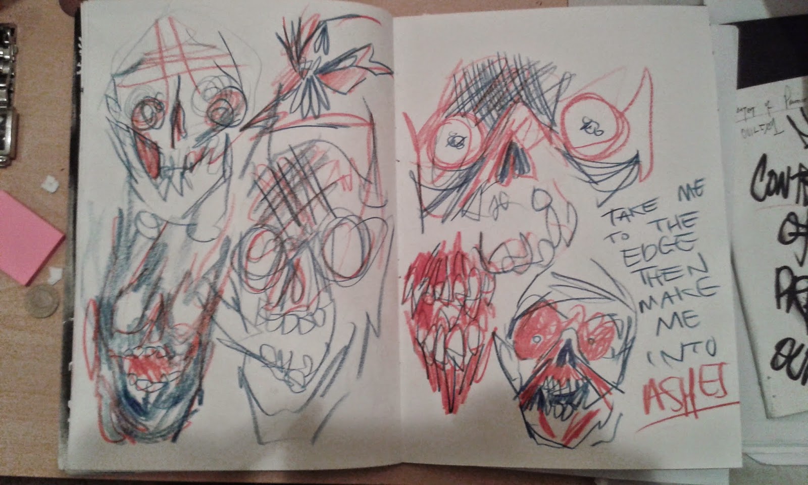
Did these very loose face, I really like the looseness of it and how the different colours work but I want to find a new way to refine it and think of something different than go down my usual path, This kind of method however I found fun and very rewarding in terms of idea generation.

Stop motion practice.


A few more stop motion animations from my phone, I'm still struggling with this (apologies for that they're not the right way round) Each video I get a bit more understanding and a but more patience but i'm till struggling to get a feel for it and really be happy with the work I'm producing or even see a route for it to go down at the moment.
Combining Ink and cutout if defiantly a way I want to go though as opposed just working with one type of media for all of it.

Experiments.


Some more experiments with form and motifs.

Top left.
Spray paints and tipex-Been wanting to try this or awhile, Really enjoy the fade out of back used with the spray paint and the quality of line coming from using the tipex pens. Defiantly a type of media i'm going to use again.

Top Right
Red crayon and black sharpie - More my usual media but used in a way I don't usually make the most of. Using masking tape to create sharp boxes of colour with a faded edge with strong black motifs over the top. I think it works well but much more as a sketch/idea generating exercise as opposed to a technique for finished pieces.

Bottom
Mixed colour crayon and black sharpie - A refined version of the above post. Still using making tape or bounding boxes to create a sharp edge then using black sharpie and negative space to create a cleaner motif and much bolder image.

Wednesday, 22 October 2014

Phil Mulloy

Was given a DVD of Phil Mulloy's work by my tutor and it's really opened my eyes to what frame by frame work can do and what can be done with it. At first I was a bit skeptical how I can make my practice and way of working fit into this module as I felt like a little fish in a big pond with no Idea where to go.

Mulloy's work is challenging; conceptual; political and hilarious and I can see some similar strands with my own practice to a degree so after now watching nearly all of his stop motion work I'm very ready and inspired to get on with this project.

My favorite I think are: Sex Life of a Chair and the Cowboy series.


Sucky stop motions.

After our lesson I found an app for android that lets you put little stop motion pieces together on your phone, so I decided to have a little play around.


I'll be the first to say, these aren't good; these aren't good quality; they're basically nothing (An they're the wrong way round....) It was more an exercise off my own back to try and get the grips with how stop frame actually looks when it all comes together.
  • Understand the need to keep things stuck down
  • The difference of between 12-25 FPS
  • That I can use collage and Ink to animate with
  • Find a way to use my creative practice with said techniques
  • Being on my phone its easy accessible and gives an element of play over work


  • Need to find a better app
  • Spend a bit longer on them
  • story board / plan more


First animation practice.


Today we started to try and get our heads round animation, stop frame.
We were put into groups, given 12 sheets on newsprint; ask to number them
and then to create 'animation' with simple motifs such as a ball or a leaf or even 
just a line.

The exercise was there to give us an understanding how stop frame worked
and the bare bones of what is required to do it.


Pros

  • Eased into the process
  • Collaborative group ideas
  • Simple motifs made for simple animation
Cons

  • I could of tried to use the time to relate the exercise to my author more
  • Used some simple animation software (App) to put it all together at the end
  • Have more input to group
  • Done something more interesting than a line that moves
All in all it was a good start but I should of done something more challenging and used our group time better to work together not just create separate objects then put them all in a space.

OUIL504 SB2 - MOVING PICTURES.


First Impressions. 
  • Could be a fun module / Find a new way of working
  • Exciting learning new skills and developing as an artist
  • It's a lot a lot of work
  • My housemate does stop-motion, I'm fully aware of its difficulties 
  • Not looking forward to doing it as a sting for my author
  • Develop my sequential thinking


Monday, 13 October 2014

Intangible theme.

After experimenting with tangible themes we then had to try and create 16 pieces of an intangible theme.

  • At first I was a little stuck, I thought to much about it.
  • Once I just started experimenting it became a lot easier.
  • I made it fun for myself and tried not to over-complicate it or think about it too much.


I started thinking of how I could make it tie in with a darkness theme. An after a crit some wrote 'If I stare at your abstract Ink pieces long enough, I start to see things that originally wouldn't of been there' and in a sense it got me thinking that's very much what a lot of people and children do in the dark. See things or are scared of that that aren't actually there. Worked out didn't it?!


Then afterwards I started relating back to moon again, using negative space and also looking at some of my more successful collage pieces for inspiration.

  • Good Idea generation
  • Produced a lot of work quickly
  • Lots of experimenting
  • Could try more colour
  • Explore more motifs
  • Push it further and analyse atmosphere more.


Paper-cut; Collage work.


Had to create 16 different collage/papercut images based on our motifs, Then receive a crit on them.
These 3 images were my favorite initially and were also chosen by my peers as the best. (I class the moon stages as one image because they work a lot better than separate)

  • I thought collage would be a waste of my time and not help
  • I actually really enjoyed doing the moon ones
  • When I got into the swing I did started to enjoy it
  • It was very time consuming
  • None of the images really seem refined or finished
  • Have to cut out and stick more tactfully. 


Theme and Motifs.

We were asked to chose a theme and 3 motifs with that theme.

Theme: Darkness

Tangible Motifs: Moon; Light; Trees.