Tuesday, 31 March 2015

SB - COLLABORATIVE

We've been uming and aring about how we're going to do this, how we're going to use our skills with the brief to create something unique and effectively something that isn't awful. I was just browsing my personal blog earlier for some kind of ideas, without holding out much hope but then I saw something that sparked an idea.

My blog is just made up of anything I find aesthetically pleasing but the ones that caught my eye were these two images:


I think it might be good to get a model to wear all white/all black so it's almost a blank canvas then just 1 or two items that hint at a subculture and who they are instead of a cliche outfit as it were.


SB 2 - COLLABORATIVE

Whats the brief asking?

  • Capture the essence and energy of subculture in a series of 3 images
  • They should work as a group and stand alone images
  • Have a real point of view for your images
  • Avoid cliches
  • Consider reflect subject style
  • Unique twist
  • Literal of abstract
  • Originate don't imitate
  • 3 Strong photographs that will work in print, cannot be collages or composites 


First Thoughts
It's different for me, being it's actually a photography brief not illustration or animation but me and Elliot are confident we can bring something creative to this a photographer might miss. Avoid cliches makes things interesting, you can't just dress someone as a punk and call it a day, you have to play this smart and play it right. I'm excited for what we can come up with

SB2 - COLLABORATIVE


Working Agreement.


(My scanners broke, had to phone it. Apologies.)

SB 2 - COLLABORATIVE

BA (Hons.) Illustration / Animation
LEVEL 05
Module Code OUIL/AN503
Module Title RESPONSIVE
Name: Kane Watson
BRIEF TITLE: i-D

What are you looking for in a creative partner? What are your aims?
Someone with more advanced skills in the fields I lack
-Animation principals

-Story boarding

-Software skills
-Someone I can learn from
-Someone who I’m on the same wavelength as me

What are your specific areas of creative interest??
-Character Development
-Narrative
-Object and Environment
-Having something to say
-Satire/Bastardization
-Humour

What specific creative skills do you have to offer in relation to a creative partnership? How do you intend to use them?
-Strong visual practice
-Effective Problem solving
-Effective Idea generation
-Wide depth of practice
-Good at decoding breifs

I can generate Ideas and solve problems very quickly since most of my ideas come from quick sketches and the way I work I can generate 60scamp ideas in under and hour which helps when getting stuck with ideas of having and artistic block.

What specific non-creative skills do you have to offer in relation to a creative partnership? How do you intend to use them? 
I really do not know

What do you see your specific roles be in the collaboration? 50/50 partnership working on all the ideas together while taking some steps into generating ideas at a quick pace and working with character and narrative for our desired brief

What will your joint responsibilities be?
-Making sure brief is read properly and understood
-Storyboard
-Idea generation


SB2 - COLLOBRATIVE

First things first, we needed to choose a brief either from YCN or D&AD. I was already quite exhausted of YCN so I focused mainly on D&AD briefs.

My choices:
i-D  - sub-culture D&AD
SyFy - Rebranding YCN
Vice - 15 Second Ident D&AD

Elliots:
SyFy - Re-branding YCN
Alice in Wonderland - YCN
Interflora - YCN

In the end we decided on my choice of i-D because it was something that seemed very manageable and also something we were in a chance of winning. A point we were told was try to go for briefs other illustrators/Animators wouldn't be going for so you have the edge of the competition. Also i'm currently writing an essay on subculture so that ties in very well for me.


STUDIO BRIEF 2 - COLLABORATIVE

We were tasked with choosing another creative to work with, It could be in our own discipline or outside of it. We were also encouraged not to work with our friends. Distractions an all. However, I live with an animator/model maker, who's in my educational year; is a great animator and we're friends. It seems absurd not too. The reasons were simple, we both have skills the other lacks; we already know we work well together and we live together so getting together to do work isn't exactly going to be hard work. 


Thursday, 26 March 2015

PROPSAL CHANGE

BA (Hons.) Illustration
LEVEL 05
Module Code OUIL505
2014/15
Module Title ILLUSTRATION 2: Applied Illustration

STUDIO BRIEF 1: Project Proposal
Project Rationale

What are you proposing to do? (Product, Range & Distribution)
Proposing to have an alternative book launch. Including two books, 4 separate prints as well as merchandise such as buttons and pins to accompany the books. Also to make some posters to advertise the event and a local independent book store.

What do you want achieve?
I want to create a book that’s something I’ve not made before, predominantly photographs of objects as opposed to ‘classic’ illustration. To get out of my comfort zone and try and add a new skill to my set.

What do you want learn from doing it?
I want to see how well my work transfers to the environment around it and too see If I can pull off making a large body of work that could of theory work as a book launch.

THEMES / SUBJECTS
What Themes/Subjects will form the content of your work for this module? This should include Theoretical and non- creative based content and concerns. This section should identify your consideration of the social, cultural, ethical and creative concerns of contemporary practice

GENERAL THEMES:
Social interaction; People; Conversation;

SPECIFIC SUBJECTS:
Out of the ordinary in the ordinary

PRACTICAL & CONCEPTUAL APPLICATION
What areas of Illustration do you intend to investigate in relation to the practical and conceptual, production / distribution of work in response to selected briefs.

SPECIFIC DISCIPLINARY AREA:
After gathering information with more conventional means; pen; paper sketching and watching I plan on going to a more 3D and photography based illustration; bringing my work off the page and into the real world as it were.

AUDIENCE/CONTEXTS:
Zine collectors; fans of graffiti/guerilla art; students

PRODUCTION / Distribution Methods:
Professionally printed zines that would be a sold a a book store or through a personal website.

CONTEXTUAL REFERENCES

Identify areas of professional/creative practices that will inform the contextualization of the work that you produce. This should include specific illustrators, studios, practitioner’s and products as well as broader creative disciplines and methods of Production / Distribution.

ILLUSTRATORS / DESIGNERS / STUDIOS:
Neckface
Ralph Steadman
Hoodbats

CREATIVE SKILLS
What practical skills do you intend to further develop and apply during your project. What do you intend to use the skills for. Consider extending the use of skills that you already have in order to deliver work of a higher standard as well as identifying new skills that you will need to develop.

I want to further develop my skills with 3D work and work that appears off paper. To find new interesting ways to get my practice in the public’s view.


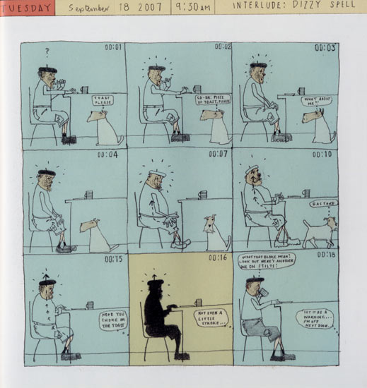
DAVID HUGHES - WALKING THE DOG


I got this book the other day and I didn't put it down. It was recommended to me and I honestly thought i'd hate it but it really is a great book, very captivating; very interesting. The best way to say what the book is about is this blurb off Amazon:

'Approaching fifty, and warned by his doctor that he's drinking too much and needs to take more exercise, David Hughes is given a dog for his birthday - Dexter, a wire-haired fox terrier. Hughes' daily walks with Dexter form the spine of Walking the Dog. We eavesdrop on their encounters with fellow dog-walkers ('Hello Hector', 'Hello Chester'...) and on Hughes' thoughts as he plods along carrying a plastic bag of poo. He begins to remember moments from his past, dark memories of murder and violence. He explores his own fantasies and obsessions. From the gentle comedy of the early pages, Walking the Dog is transformed into something deeper and more disturbing.'

After reading this, it's really got me thinking about what I want to do with my project. I think I was reaching for something that would almost make the reader recoil in horror or feel bad about whats happening and I thought thats what I wanted but it's not. I think I just want to put something together that someones interested in. Just about things in Leeds...hmmmm


MYRA KALMAN - PURSUIT OF HAPPINESS

Myra Kalman sets out to do some work on A. Lincoln and finds herself almost becoming infatuated with the man. Obsessive over finding out new details and meeting people who have an glorified opinion and to visit places where we visited and whats more, she seemed to have real fun doing it. It's a very charming book, that does conventional illustration to a tee, tells a real story through pictures of Myra's journey to finding A.Lincoln. It's got me thinking on where I want to go with my current project.


505 Research


Looking at statistics and all that about all the bad things that happen in Leeds. There's a lot of it. An being a skint student I live in quite a rough area and here my fair share on things. After just breifly looking at it I'm starting to think it's a bit much. Not in that I can't handle that kind of thing but I'm aware I tend to stumble in this direction with my work so maybe I should consider something more light hearted?


Tuesday, 24 March 2015

NEST!


I was approached by a friend on mine who has currently written for the College publication know as 'NEST' It's a cool; free little book thats got some really cool work in it so it was awesome to be asked to do it. Hey sent me an e-mail of what he'd written. It was about how art is a form of nutrition for the mind and all the weird parts of it should be accepted as part of your artistic 5-A-DAY.  Which included but not limited too: Drawing giant butts; fucking fruit'..interesting.

'Just do what you feel like doing.'
Perfect.


Done.


WRAPPED CO.

WrappedCo. brief.
Deadline 20th March.

Wrapping paper; repeat print; Free reign; A2 - GO!
 Using previous designs from older work and working it into something new as well as drawing up some new ideas make this a really easy brief; and really fun.  It was great to take work from other places and completely re-brand it for this brief. Was a nice cool off. Actually really enjoying making my work into a repeat pattern print; it might be something I consider looking into more in the future. It's never been something that even crossed my mind, but now it's there. It's staying


Done.
Aaaaaaaaaaaaaand it's live:
      

DANCING CAKE

So turns out I wasn't finished.

In short....


Done.

DANCING CAKE

Final


Done.

DANCING CAKE


After putting it through photoshop and illustrator I got this little guy out of it, After playing around with some patterns and negative space I think it's work out pretty groovy.

DANCING CAKE


As much as I'd like to pretend this was a strenuous task and it took forever, I'd be lying. Turns out drawing cake isn't that difficult and monsters and kind of my forte, so after playing around for about 10/20 minutes I had a character I liked and was ready to go forward with.

UPDATE:
Band like the initial design, I can go ahead and finish it off and mock it all up for them.


DANCING CAKE

Weird as this maybe, I really don't have a sweet tooth, So I had to look at cakes for ages to get and idea of what the best angle to draw and monster cake would be. Weird right?


DANCING CAKE

Client: Dancing Cake (Local Leeds band)
Brief: To design a T-Shirt
Specifications: Simple design, One colour (Pink) Anything as long as it represents the band.

Research:
A 3 piece Grunge/Emo/Punk band from Leeds


In conclusion I don't think I'll have much a problem with this brief. It's pretty simple and the band are almost satirical and I think it'll lend itself to my practice pretty easily.

I'M BETTER AT TAKING NOTES THAN YOU.


Monday, 23 March 2015

Boston Manor Extras

I did a few more designs for Boston Manor in a mock up form, Just to extend the breif and have a bit more fun with it. It almost looks like a catalogue of their merch now, maybe? An that's kinda good.


Done.

Boston Manor


This was the final mock up I did for them. Notice the circle is jagged now not clean and the big font on the bottom (Which I think looks stupid)
UPDATE: Convinced them not to have the logo on the bottom (WIN)


Done.


Boston Manor

We're all happy with how this turned out, they liked it. I sorted them out with this design. Like I said I know them so I didn't charge. They're my friends. It all works out really, They'll give me a tshirt and they're getting a following so I might get more work from it and I get into their shows V.I.P for free So it's all swings and roundabouts.

Henry quickly asked me to do an all caps logo for them based off this design on another bands. It took me 5 minutes If that.


Boston Manor


One I know what I'm doing I can knock things together pretty quickly.  So I emailed the final draft to Henry before I mock it all up for him and make it t-shirt ready.
UPDATE: Henry rang me saying that they're doing two colours now so can I work that into it somewhere and then he sent me this:


After I pointed out that that font as terrible and that is in fact 3 colours not two. He wanted to keep the red put I pointed out the red rose heads with with stems would look odd, and not right but i'll sort something out for him.

Boston Manor


On webcam to Henry showed him this. His response. 'YE MAN! That's so sick, I'd have that on my wall like - but I don't think it's right for the band' ..... Brilliant. Luckily I saw this coming after the numerous times and decided I'd show him a few more things I'd been drawing.


Showed him this awful drawing of a snake and roses and that was it. Decided. They all decided there and then, that was what they wanted so atleast now I know what I'm doing.


Boston Manor


Since the bands always on tour, Waiting for responses can be a lil while to taking forever but I'm cool with that. Accept when the band can't agree on a design and Henry says 'Ye, we're not sure man. We're really into whales at the moment'

So It looks like I'm drawing a whale, not a problem but if i'd of known this in the first place. The shirts could probably be printed by now...