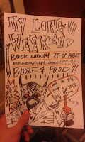
Wednesday, 28 October 2015

Animation

After finishing some of the drawing for the Zines I decided this was the perfect time for me to start and practice with animation. So I chose one of the pieces I wanted to slightly animate. So i chose on the images (Below) and began.


(IMAGE NEEDED)


I approached my housemate, who I have collaborated with before as he is an animator and would be a vital asset to making this happen. As there are many ways to animate something we decided for what I wanted to do, the best option was a frame by frame approach. All I wanted to do was make it appear that the monsters hands were dripping.

We began by setting up a light box and then began drawing frames for each 'droplet'


After we had 20 frames of animation, we scanned the separate images into after effects and used the 'JPEG SEQUENCE' function to create the animation for us.


This was the absolute basic of what we needed. I think they turned out quite smooth and functional. From there It was simply a matter of editing the drips and re-sizing onto the desired parts of the animation and after a big of tweaking then importing it as GIF format on photo-shop  It was finished.


On the whole I'm really pleased with this as a first attempt. I'm aware it's only a very simple animation but as a starting point I think its good. I'm going to do a few more like this, with subtle nuances to them then move on if I feel comfortable.

I think it adds another level to the drawing, adds more macabre and menace to it. It brings it too life and I think that's important for my practice to have that. 


Zine doodles

Breif:
2015 Thought Bubble Zine Brief – Level 5 & 6 Summary Brief Create an A5 12-page Zine plus front and back cover (4 A4 sheets photocopied, folded in half and stapled or sewn together). Your choice of white or coloured stock. There is an example mock-up of a zine on the noticeboard outside Studio 1. Make a minimum of 5 copies to be sold at your table at Thought Bubble. Thought Bubble dates: Saturday 14 and Sunday 15 November Zine deadline: Tuesday 11 November, 4pm in Room 236. Zines must be packaged and ready for sale. LEVEL 5 ONLY: Interim progress feedback will be given during your Progress Tutorials in the weeks of 19 October and 3rd November. If you want a brief crit of your zine work during your OUIL504 Progress Tutorials on these weeks, bring your zine work to show.

So I've been doing some doodles for it as I was up in the air with what I wanted the Zine to actually be about and the content of such; then I decided since it was almost to represent the college I was just going to put together pieces of my practice, makes it less stressful and quite nice really.


Breifs

After my crit on statement on intent I am going to fill out slightly more in depth ideas of my briefs and then go on to write a new statement on intent.

BRIEF TITLE Tattoo Flash
Brief
To create a unique sheet of tattoo flash once a week, each week attempting to cycle through traditional tattooing styles and also then my own unique style to build a large and diverse portfolio for after university as well as getting crits later on off tattooists in the industry
Product
A tattoo flash based portfolio
Tone of Voice
/
Audience
Tattoo enthusiasts; Tattoo collectors; Any person that could be interested in the art form; Tattooists
Context
Keeping in line with the current trend of modern tattooing
Additional information/Considerations
Personal project mainly to be used by me to help after university
Mandatory Requirements
A4-A3 sized sheets to fit into portfolio sleeves
Deliverables
Tattoo Flash portfolio.

BRIEF TITLE Anti-Briefs
Brief
To select live briefs and answer the briefs in my own unique style. Almost answering them with a statement on the company/product/idea in question. Almost a slap in the face to companys and products I dont agree with e.g A new branding for water that will tell people it will keep them healthier while costing £3 a bottle
Product
Depends on brief
Tone of Voice
Satirical / Humour
Audience
Depends on brief
Context 
Depends on brief
Additional information/Considerations 
Depends on brief
Mandatory Requirements
Depends on brief
Deliverables
Depends on brief

BRIEF TITLE  I-D
Brief
A brief i produced last year, it is to create 3 stand alone images that also work as a set to display current youth subcultures. The images can be analogue of digital but must not be a collage of work just a straight up image, yet can be edited in photo shop be be used on screen and in print.
Product
3 stand alone images of current sub-culture that also work as a set
Tone of Voice
/
Audience
Young adults
Context 
Youth culture is always changing and we want to see what current sub-cultures are around
Additional information/Considerations 

Mandatory Requirements
Image cannot be a collage of other images
Deliverables 
3 stand alone images that can be used as a set

BRIEF TITLE Animation
Brief
To create basic looped animation to extend my practice and get to grips with animation. If I get to grips with it early on I will try and create more complicated animations
Product
looped gifs or 5-10 second animations based on my drawings and practice
Tone of Voice
Horror / Humour / Satire
Audience
Illustrators; creatives; young adults
Context 
To improve my practice I want to add subtle animations to my work, I think it will make some of my work come to life and also add more depth to my work and practice
Additional information/Considerations 
A personal project again so the deadline is more loose but I want to create a body of animated monsters and people
Mandatory Requirements

Deliverables
A multitude of different animations

BRIEF TITLE Flyers
Brief
The amount of information students receive via flyers through the door and sheer amount of posters around town in mad. I want to take these flyers and posters and re-craw them for the same event/night/restaurant and add my own spin on them
Product
To create an online anthology of the same bodied work based on the advertisements students get bombarded with which then the best could get selected and made into zines or a book.
Tone of Voice
Satirical
Audience
Students; young adults; creatives
Context 

Additional information/Considerations 

Mandatory Requirements

Deliverables


Statement of Intent - Peer Review 2

Comment on Clarity of Rationale
Strengths

Pretty clear - identified what type of work you want to do and the sort of thing you want to do post college
Suggestions
Be careful 603 doesn't encroach on 601 too much there has to be a synthesis but it's got to be balanced well

Comment on Clarity and Appropriatness
Strengths
Lots of stuff, know what you want to say in your work which is great
Suggestions
Maybe but it down a little bit? A lot are technically sub-themes. You don't need to go too mad

Comment on appropriateness of products and distribution
Strengths
You identified products and M.O.D's which is good
Suggestions
Any other things? Illustration fields? I know tattooing and sub-culture is where your heart is but you'd be a great political artist

Comment on appropriateness of skills/meda
Strengths

Lots of proposed media to work with
Suggestions
I know Aggy is right,  more formats your work could go into would be great, Where else do you see your work?

Briefs
Brief 1 : Tattoo Flash
Clarity appropriateness of Brief
Good portfolio builder if you're looking for apprenticeships after work
Considerations/Suggestions
Be sending these out to practices you like, Get Feedback.

Brief 2: Anti Briefs
Clarity appropriateness of Brief
The perfect thing for you, a great way to do competition briefs without having to suffer their bullshit
Considerations/Suggestions
Be careful not to get bogged down in bad briefs, taking the piss is fun but try not to get too bogged down

Brief 3: I-D
Clarity appropriateness of Brief
Has potential to be a really thoughtful project
Considerations/Suggestions
What are the images to be used in? Book/Mag/Internet? What's their purpose?

Brief 4: Animation
Clarity appropriateness of Brief
Good skill builder, lead you out your comfort zone.
Considerations/Suggestions
Where are they going to go? What are they going to be about?

Breif 5: Flyers
Clarity appropriateness of Brief
Really funny, has potential to be be bigger again
Considerations/SuggestionsAgain, lacks context. Think they'd be great in a book/zine

General Comments:
You have clear direction but I think you run the risk of pigeon holing youself too much. You have a lot of really good things to say - Why not explore some work about stuff that piss' you off about today's society?

Suggested References
Jean Cornella
Charlie Brooker
Go read Private Eye and write and draw something better, funnier and more thought provoking (please)


Statement of Intent - Peer Review 1

Comment on Clarity of Rationale
Strengths

I think the rationale is Clear. Youve stated the type of work you want to be producing and improving more of-Good that you've got and aim to work towards.
Suggestions
Have you identified professionals you want to work with in this field?
Start contacting them.

Comment on Clarity and Appropriatness
Strengths
Themes and subjects are appropriate - It's very you. Related to rationale-Comment on modern culture and society
Suggestions
/

Comment on appropriateness of products and distribution
Strengths
Good range of products to start off with
Suggestions
Could maybe look at making Zines each month or something with different themes live you've mentioned

Comment on appropriateness of skills/meda
Strengths

Skills/Media/Process all seem relevant to your practice - good to be improving the skills you're good at but also good to look at other skills like sewing and animation
Suggestions
I think you'd be good at making those short panel comics in newspapers that comment on modern culture and society - could give comics a go

Briefs
Brief 1 : Tattoo Flash
Clarity appropriateness of Brief
Good that you're producing tattoo flash once a week - being constant is good
Considerations/Suggestions
Will you be designing flash that has different themes each week? Might be a good challenge for you

Brief 2: Anti Briefs
Clarity appropriateness of Brief
Brief will allow you to improve skills in making work for clients/time management and meeting deadlines
Considerations/Suggestions
Have you started looking for any live / competition briefs

Brief 3: I-D
Clarity appropriateness of Brief
Good idea to go back and try and tackle a brief in a different way and hopefully and improved way,
Considerations/Suggestions
////

Brief 4: Animation
Clarity appropriateness of Brief
Will allow you to improve you animation skills you said you wanted to improve
Considerations/Suggestions
Look at the loop-de-loop competition (cant remember what it's called but it's on e-studio)

Breif 5: Flyers
Clarity appropriateness of Brief
I DON'T UNDERSTAND THIS ONE
Considerations/SuggestionsI DON'T UNDERSTAND THIS ONE


LVL 6 Statement of Intent

Leeds College of Art
BA (Hons) ILLUSTRATION
Level 06 OUIL603 Extended Practice Credits 60
STUDIO PRACTICE  Statement of Intent


Name Kane Watson
Blog Address http://k-watson1316.blogspot.co.uk/
Date 10/15

Rationale
Throughout this module I want to create a body of work that reflects my practice an view on modern culture and society while improving my skills. The main ones refining screen-print and pen and ink while also trying to get to grips with animation. While adhearing to my usual practice I also need to make time to focus on work that will benefit me outside college life and from wanting to be a tattooist this means I will have to focus on more tattoo based flash work as well as contacting professionals in that field.

Themes / Subjects
Themes
Horror

- Monsters
- Fear
- Paranoia
Dystopia
- Anarchy
- Mod mentality
- Repression
Fashion
- Sub-culture
- Alternative
- D.I.Y
Culture
- Art
- Society
- Repression

Products / Methods of Distribution
Products:

Clothing; Patches; Stickers; pins; prints; figures
Distribution:
Online store; word of mouth; exhibitions

Practical Skills / Media / Formats
Screen printing; pen and ink; acrylic paint ; animation; digital art; composing; sewing.

Brief 1: Tattoo flash
Deadline
Rationale:
Produce a portfolio of traditional and unique tattoo flash (one a week) to prepare a body of work for personal interests and for after university. While contacting proffesionals in that respected field.

Brief 2: ANTI-BREIFS
Deadline
Rationale:
Finding live and competition briefs for company’s or products with brief’s that I find either ridiculous or unethical and answer the briefs with a response and enter it with a piece of work that answers the brief in a way I see fit.

Brief 3: I-D
Deadline
Rationale:
A brief I did last year but something I want to look at again and tackle in different way that also influences my COP so produce a series of images that represent modern subcultures
Brief 4: ANIMATION
Deadline
Rationale:
Setting myself the task of tackling animation at at least some basic level by producing 5-10 seconds animations (GIFS/LOOPS/ETC) which will increase my web presence and expand my practice

Brief 5: FLYERS
Deadline
Rationale:
Collect and photograph flyers posted through students doors for nights and reproduce them oin my own style to create a large body of satire work.


Monday, 10 August 2015

505 RE-SUBMISSION EVALUATION

505 is the first module I've not passed and It really disappointed me, being that I wasn't too displeased with my final book and I did feel like of all my modules this wouldn't be the one that I didn't pass.
Now as I am beginning to write this evaluation I'm worried I might not pass th second time around, which really does worry me.

Last year a few things weren't going right for me; at university and in my personal life, this isn't looking for pity but it is me acknowledging that if I'd have swallowed my pride and spoke to someone about what was going on I might not have ended getting so overwhelmed and then getting really lost then snowballing at the end of the year.

I took a much closer look at how other artists do things as well to better inform myself, usually I just go for someone who's practice I like and just say I like it then move on. This time around I took a much closer look at what some people where doing and how they were doing it. Even if it wasn't 100% for me I made sure that I took something from each person I looked at.

Snow-balling I believe is the best word for it, with the project I was never really sure where it was going or what I was actually doing with it. I just kept throwing ideas together and then just trying to keep spitting out idea after idea. I wasn't stopping to reflect on my work and what I was doing; if it was working; and who it would be for. I just kept on throwing things and hoping that they stuck. Which explains why I failed the 5A7; 5B5; 5B6 and 5D5 I never reflected on what I was creating or even really wrote much on my blog about why I was doing it. I was just making work; uploading it; making work; uploading it in a cycle when I should of been checking the learning outcomes more thoroughly.

5A7:This time around I have thought about the audience more and the social context around my work and where it fits best in the world, well in Leeds mainly and I believe I have created new and better solutions to my brief.
5B5: Social and Cultural came became more apparent to me when I started just using people in my house, It made a very diverse set starting points in the first project much more steam-lined, as well as choosing a better place to have the book launch 'Colours may vary' It made much more sense with the whole culture scene of Leeds.
5B6: The re-submissions whole point for me to find a new starting point for practical approaches to self determined ideas when I decided to have a firm starting point and game plan after what I'd learnt from my first failed attempt
5D5: Even though not been able to attend workshops over the Summer I feel, that I made the most of all the equipment I had at my disposal and I managed this project much better than usual.

I feel that with the re-submission I have taken time to look at what I'm doing and explain why I'm doing it. I was evaluating my use of colour; and drawing style and why I was taking the photos and adding the captains and how they related to where. As in last time I was just getting quotes from anywhere and then just adding them to anything this time. I set myself the task of just taking notes from people in my house. An that's the only place I could take the notes and therefore the only objects I could use were ones in my environment which makes much more sense.

I'm still worried I've not passed again, I have a bad habit of getting carried away with work and I always forget to check the learning outcomes and what IT IS I NEED TO BE DOING as opposed to what I want to be doing.

This project has taught me a lot, Even though it's not been an easy ride this year and it's still quite bumpy if I'm honest; I've had more distractions that I'd of liked in my personal life but I think I've managed to make the most of the time I had. This project has taught me more about myself and that I need to stop being so prideful and stubborn and ask for help when I need and to stop being so closed off. I've still done it for this re-submission I've had help there and I've not taken it but it's something I'm going to continue to work on.

BOARDS

I 100% forgot I had to make these, and this is very last minute which is my fault for not double checking on everything. But here I've at-least tried to throw some new boards together with the new things even though it's not quite as polished as the previous boards. I scored higher on this in the module outcomes so I wasn't focusing on these but now I wish I would have put more time aside to finalize the products and boards.

ATTENTION


I found this box in town and I was going to draw on it there and then but I didn't have my camera so instead I took it home. Now this is something I think would be very interesting in the communication aspect of my launch. With my posters being scattered around if I also did more guerrilla advertising and a graffiti style it would get more people attention I believe. This would in turn attract the type of audience that I would be aiming for. The creatives and people who are interested in graffiti and that type of anarchic artwork. I for one know if i saw a poster I liked the look of I'd be interested but then if I started seeing it advised on non traditional objects I'd be much more inclined to go.

In short this would play a pivitol role in attracting the audience I'm after. The more underground, anti-art lovers and artists themselves. My posters would get the right people interested and then the more non-conventional advertising would secure a wider yet specific audience for me.

I am however a bit bummed that I have only just thought about doing this as it is something I feel I could of explored more.

T SHIRT DESIGN

Since I liked the patches Idea, I thought it would be a waste not to also design a t-shirt. It's very lucrative market and I could easily screen print my own t-shirts which would save on so much as and therefore boost my profits.

I decided to take a design from my patches and clean it up a bit then do a little mock up of it.


Again I think the continued use of black on orange on the whole range really brings it all together and makes feel like much more of a collection of work, that would all be designed and distributed for a book launch.


STICKER///PATCH DESIGNS DESIGNS


After looking at DAGGERS FOR TEETH and back at MARK BREED's Zine I looked at he also runs HOODBATS where as well as ZINES he sells patches and T SHIRTS so I decided that designing patches and stickers to go with my book launch as a definite way forward.

I've stick with the whole black and orange vibe, which is quite halloweeny too which is cool, I mean that's not too far off is it?

If I was to go into development the two seperate ones I've chosen would be designs I developed further and then got printed and made. I think they reflect the Zine well and my practice as a whole. I would like to initially get 4 patches made from these options but if I was to go through it would be a risk. It's much more money and being a 'new artist' there's a risk I might not be able to move that much stock.

Looking at DAGGERS FOR TEETH helped a lot being that he is someone who is very well versed in designing patches, taking a look at it work was important. The use of negative space really helped me get designs flowing quick. An remembering when getting patches made any white space can be converted to another colour quite easily before production. Also Craig usually uses 2-3 colours which helped with my colour scheme too as in where to add hints of colour that would be the most effective.


DAGGERS FOR TEETH

Daggers for Teeth is a brand ran by Craig Robson and he's super popular. His stuff is always selling out and he's always being commissioned for things. I first got into this stuff for his patches. He makes really cool embroided patches, not by hand. He designs them and gets them made but still. Then I decided I don't have the money or resources to actually make some but I'm doing to design some patches and stickers that would accompany my book launch. Since it would be at colours may vary knowing the space and how to fill it, will requires a lot more than books. Which is completely fine. As well as making more things means selling more things and selling more things would mean more money.


DAGGERS FOR TEETH.


DAGGERS FOR TEETH PATCHES


COLOURS MAY VARY


As I put on my posted I would launch my Zines at Colours May Vary this is for a few, very important reasons. 
  • They're local to me
Living in Leeds it makes sense to try and use an already popular and established venue that have hosted many great local illustrators shows including Drew Milward. Also it makes more sense than a venue anywhere as even though e-mail is all well and good it's a 10 minute drive there so nothing is too far of a reach to sort out.

  • We know them
Considering the whole of our Illustration course has already held and exhibition there we know how it works and what the owners are like (super nice) so it's not too much of a push to extend the hands and hold my own series of work there if I could prove I could fill it.

  • I know people
This again falls into that they're local but from living and being social in Leeds I know a lot of people and what's more I now a lot of creatives that would in fact come to a book launch, It'd be free too look around and its only down the road.

  • They're fair
Given the climate of me being skint and no ones exactly falling on good times I find Colours May Vary are very fair in how they sell work.  They just take a cut of whats sold. 60/40 or 70/30 depending which means no ones entirely out of pocket when it comes down to it. I wouldn't have to fork out anything for the space and therefore I don't really have much to loose.


MY LONG WEEKEND-FINAL ZINES


I'm quite happy with these. They keep the parts of illustration that deem important for my practice strong. Anarchic; D.I.Y, Punk; Personal and attitude. Now I can see how some may deem my work unfinished and almost not thoughtful and to an extent it is. That's what my work tends to be, It's an instant response to something. I can always go back and craft how I make that response and how it is informed but I find I get the most of out my work and I say what I want to say best when I get it out quickly. As well as researching media; technology and other illustrators and the techniques that they use has really helped show me a path to take and helped better this project.

MONDAY ZINE


You'll have to excuse this one. Because I'm aware on first impressions it looks like a real cop-out and like I've just given up or not bothered but let me explain this one to you and then explain why I think it makes sense.

Short story, no pity wanted: I had 5 dogs, one got attacked by 3 other dogs and she died. As anyone is, i'm very close to my dogs and my family are too. It really really upset my Mum so I had to go home to try and help and sort things out.

Now I really thought about doing this Zine or just choosing a different Monday but then I thought no. I said I was going to describe in these Zines what's going on, around me and how I view it. And that's what I've done. Now yes, if you saw this Zine on it's own you'd think nothing of it. It's just pictures of words. No drawings or anything BUT I think with it being part of a bigger project and if you look just how intense some of the other covers and Zines are then it adds a really humbling episode to the persona, that for people who don't know me it proves i'm a real person. It might not sell a single copy ever if i made it but it works for me and what's more it helped me.

FRIDAY//SATURDAY ZINES


TWO MORE DOWN. Both contain the usual immorality and in keeping with the pattern, there are changes in the composition; the use of digital; drawn and photographed and all work with a pen is solely black and orange. I believe they all work quit highly as a unit or Zines. I'm also very happy that I got the black and orange colour scheme down quickly. It could be argued I could of experimented with other schemes but as soon  as i saw it I was happy and didn't want to waste time. I tend to do a lot fo two colour work and I know how much I like black and orange the only other colours are yellow or lime green but neither photograph or scan too great; and I feel they loose a lot of 'UMPH' during the editing process.

ALSO

The last page on every ZINE is now the same; I decided instead of an image I was going to use somewhat a blurb just a quick informative paragraph to explain what people are looking at. My last book did not have that and I think it's something simple that really puts things into perspective.


'THIS COLLECTION OF ZINES ENTITLED ‘ MY LONG WEEKEND’ (THERE’S 5 TO COLLECT YOU KNOW) IS SOMEWHAT OF A DIARY FOR ME TO SHARE WITH YOU, AND WHAT I WENT THROUGH ONE LONG WEEKEND. BY USING MY DECREPIT HOUSE AS A HUB AND TAKING NOTES OF ANYTHING OF INTEREST THAT HAPPENED IN MY HOUSE I WAS ABLE TO COMBINE MY PRACTICE WITH THE VERY OBJECT AND ENVIRONMENT AROUND ME AT THE TIME. GIVING YOU A GLIMPSE INTO WHAT I SEE AND HOW I SEE IT. 

NOW BUY THIS ZINE OR I’LL EAT YOUR DOG'


SATURDAY NOTES

SATURDAY NOTES
E: I'm scared i'll be ONE of the bitches
K: i DO NOT LIKE PANCAKES
E: It's just a dick in the arse
B: Ye but, backwards poop
K: The good things are killing me
E:All outta dick
K: hhahahahahah fucker
B: I bet Olly Murs is really nice
B: I've danced naked so much
K: Need a visit from my old mates DR.SHOT and MR.BEER
E: Those are some dick head shades you've got there mate

Saturday was hangover day but we didn't have much to do so we went for a pub lunch which then lead to having a pint which then lead us back to our house for a few more hair of the dogs so come around. It worked. Taking notes was a lot harder; much more groggy and less energetic than the night before as well as me not being super switched on.

FRIDAY NOTES

FRIDAY:
K: I bet crack does make you do some weird things
B: Never again are we playing cock trumps
K: I love you more when you're angry with me
K: You're so boring when you're nice
B: That's pure gay
B: Ye, company around my dick
K: Why're you looking at your Belly?
E: Have I got my stabby eyes on?
K: Fuck that book
B: PINTS MAKE PRIZES
E: SHIVSHIVSHIVSHIVSHIVSHIV
B: Whose are those bones?
K: Cheap cider, this is my mate
E: COOOOOONDOOOOOOOOM

Friday was quite an easy one if im honest, We we're all drinking, I mean we have been for most of these day but Friday was just more planned and when everyone gets together for drinks there's always some stupid conversation being throw around.

Because I scrapped the drawing of people from my first 505 project (Which in hindsight was a stupid waste of my time) and also just took notes from my house and the people in it, it makes it much easier to relay it to a book and make it make more sense, as well as using more relate-able objects in and around my house. It's obvious to me now, taking quotes from one place then putting them into another without rhyme or reason makes little sense.

Sunday, 9 August 2015

WORKING WAY

Apologies for the bad photo.
This is just to show kinda my process of choosing quotes. But I'm going to explain it here so you can actually read it.

Start on the night writing down anything I like the sound of, Some nights are better than others; sometimes I'll fill 3 pages and sometimes I'll barely fill one. Once I have the nights worth of quotes; I'll look though them and choose the best 10 (the ones that jump out at me or instantly give me an idea for them) and from there I write them back down; then with a different colour pen brainstorm what might work the best for that idea. Be it a drawing or a photo.


SUNDAY/TUESDAY


SUNDAY/TUESDAY two books that are currently finished! Which is awesome. Looking back it can't understand why it's been so difficult to get them done. I think I'm second guessing myself a lot since I've already messed up this project once I'm quite worried I'm going to do it again. I believe this are a good progression from the first book I submitted for 505. These books encompass more of my practice and have much more fun aura around them.

The last page on 'TUESDAY' you may have noticed is a digital drawing over a image. That image was taken from the internet. I decided on it after looking at more Jon Burgerman's work. The problem with me for the first book mainly, and the problem i'd been having with these is sometimes the quotes are great and they could be funny but it's not always practical to find something to draw on. So then I went to drawing on paper and including it but now i've also decided to draw over images on the internet digitally. It's a super quick process that I quite like HOWEVER I'm not too sure on the pink; it doesn't fit with the rest. As all other pen work has been black or orange.


These images of Jon's are what made me start to add a little digital to my Zines, if anything just to make them a bit more interesting and I don't know why I had barred myself from doing ti anyway, It fits perfectly well with what I'm doing; it's add more and takes nothing away. Jon's work I think just reminded me that it was an option.


Saturday, 8 August 2015

Drawings.


Here are some drawings I've done for my books. These include two front covers. I was originally just drawing in black. but It felt a bit lacking so I decided to add orange. I'm keeping this two colour scheme going, Especially for the front covers as I feel that it helps bind them all together so it's more obvious that it's a collective of Zines.

SUNDAY NOTES

I take my notes in one of two ways. Since I don't know when something Is going to be said that I might want to use I always try to have paper and pen on me but fail that I will have my phone so I can just add the things to my notes and come back to it.


Just quick examples of how I take notes, It's usually quick an frantic when It's on paper but then on my phone it would appear to have more structure. It's actually better using my phone as, It saves all of it in a easy place and I won't loose my phone. I can loose the paper I write these on sometimes. Or they get mistaken for scrap and thrown away.
SUNDAY
E: I'm gourmet! wait...Is that a good thing?
K: I'd hire an escort, they're lovely
E: Toast Tits
K: Someone stole the microwave out the garden,
E: Willis the toaster
E: CLEMENTINE
G: shiv; Shiv; SHiv; SHIv; SHIV;SHIV:SHIV;SHIV!
L: Bag full of fuck you
E: It's just a knob in your arse
B: I'm gonna fart my way into her pants.
G: Fucked it
K: All Dem Ciggies!
B: I'm a big big fan of pears
E: Pears are the poor mans watermelon
K: Oi, You need to watch your hairy tongue mate
B: Wanna get yourself a slice of this looooong greasy dick
G: Ew, no wait - What?!
K: I'm a big fan of everyone here, or atleast this whiskey is making me feel like that
E: Drugs are for pugs
B: I bet dog food tastes kinda ok, if you didn't know it was dog food
K: Your words are making me want to go to bed.
E: You're not a fun sponge, your a fun vacumm
B: I bet your the ace of spades that you throw up
K: I bet you my keys that I don't hurt myself


Jon Burgerman


Jon Burgerman is a contemporary Illustrator who is currently very popular doing ads for Coke among others. His sense of play is what makes him interesting. He uses the world around him to have fun and create interesting and dynamic pieces. Jon's practice may appear a world away from my own but i've been on his website and taken pieces that I find interesting that I think reflect my work in ways. I'm hoping that in taking a closer look at Jon's work that. We actually spoke to Jon via skype in university which is where my interest started.

He tries to make "interesting things"
"Having an idea and perusing it in the best medium"
Most of his work is self driven
Studied Fine Art at Nottingham Trent University
Overlapping of his works through medias "From mural to mugs"


Digital

After using photoshop and Illustrator to vector some of my work to make it easier to lay over my photos I decided to try and few more examples with me adding my work digitally over the top of the photos I've been taking.


Even though I did this based on Mark Breeds work, I just don't think it works with these images, For me the contrast doesn't do either media justice however I think the drawings do have merit on there own SO unlike my first book 'Don't Get Too Comfortable' these will feature illustrations in them. In that way I still relating to Mark Breed and keeping my work fresh. I think it will also keep some ideas from getting stale as in the first book some of the pages weren't the best as sometimes It's hard to get a good image with the quotes I have so aesthetic suffered.

Wednesday, 5 August 2015

Next.


Since working with the different compositions helped my book along and made it more intresting to flick through I've decided to take the idea from 'Mark Reads - Looney Bin' Zine and add my own drawings onto pages. I'll be doing this digitally.


So i'll take an image like this,  take the separate images from it and then scatter them around certain pages. Like so:


On second thought I dont actually know if this works. It looks a but thrown together and almost like it's not meant to be there BUT I also like it a little bit so a bit more play will help me figure this out.


TUESDAY STARTER

This list I made for a Tuesday:

TUESDAY:
G: I'm gonna get a hunting rifle, I'm a mad man and what?!
G: 14 DAYS MAN! 14 DAYS!
G: It's all dem ciggies mate, ciggy butt brain.
K: The utility people are pissing me off AND THERE'S FUCKING WATER EVERYWHERE!
K: I'm back in zero pounds club.
G: Slashman Steve took me from behind
E: I fucked it and i'm sorry
J: Get your pizza foot away from me!
G: The whole of Dagenham was out of drugs.

I decided to use this list as one of my books since it helped get the ball rolling and get everything done properly. I have nearly all the words I need now. It's a been a bit more difficult than I though since a lot fo my house mates have been away and I didn't really want to make anything up.


As you can see on pages 6 and pages 7/8 I've used the composition I saw in the Zine 'Very Flat' I think it makes the a more interesting read and too look at. 


Tuesday, 4 August 2015

Some more posters


Here are a few poster deigns I've got together. Some are finished some are not. After looking at People like Neckface and Mark Breed two contemporary illustrators who make a living with the kind of practice I find myself falling into. They make most their posters and advertisments one offs and leave them around places which is what the posters done in markers are. One of posters to be left where I please. Then i'm going to choose one or two posters to make digitally so they can be reproduced and put around. It's the best of both worlds I think.
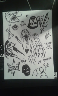
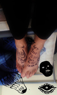
LOONEY BIN

LOONEY BIN
Mark Breed


Mark Breed owns and runs HOODBATS and fairly successful if somewhat underground clothing make and every now and then he releases little sketchbook esc Zines, I'm a big fan. They're very D.I.Y looking with scanned images and drawn images over the top to create a dark; seedy; manic and anarchic atheistic which is what I'm aiming for. I think this Zine helps answers the qustions I was having about the posters I had been drafting up. Since My posters were all hand drawn with sketchs on them it didn't reflect the outcome of my Zine would but if I combine some images with my photos it'll add to the finished outcome.  


First Poster Draft


More pages from 'Looney Bin'