Wednesday, 30 April 2014

All


All my final images, I think they all look they they belong, and almost have a vibe of G.S.H but it's not what I wanted, I don't know. I think because the man accomplished so much and was such an inspiration I was never going to keep I did this project justice. 

STAMPS


The stamps were almost an after-thought for me, I picked them by looking at my final images for a postcards and then chose either scamps; sketches; drawing anything from my body of work that I felt put across the same tone of voice of the rest of the work in this project so it all fit. Two spots and two full figures. I think it all works as a set, deciding to use two green two brown to keep the dynamic of the whole set working with the other pieces in the project.

Vector cards


Same as I did for the piano, changed them all to a vector then added a boarder and a colour, I think the green is neutral enough to compliment the brown while not taking anything away from the images.

I think looking back it would of been good to use the frame in a more dynamic way like I did for the final knife image, keeping a boarder makes them all appear more formal but I think having different dynamic boarders it would be more interesting while keeping them all in line.

Postcards

The Bottle; Pieces of a man

Me and the devil; New york is killing me

I decided for my 4 postcards I could choose my 4 favourite songs from G.S.H discography. They all speak to me on some level and they make me feel certain things when I listen to them; something I can't put my finger on, they just speak to me. An the images in question and my translation of what those songs mean.

l

Rejected idea for 'New York is killing me' I shouldn't really need to say much why I didn't pick it, it just looks poor. The two different pieces don't fit together very nicely and isn't pleasing to the eye. 

Poster

Final poster.
Looks a little lacking so there may be some editing to do yet but I didn't want anything to take away from the quote and the piano because that's all i'm trying to say. Gil Scot Heron even in his own opinion is a piano player and that's enough.

I went back and forth from using colour or keeping it white, white was far to stark and intense, it's always fighting with the black so I decided on a light brown it's neutral doesn't take anything away and compliments the image. There's a lot of improvements I could make, the shadow doesn't quite sit right and everything almost looks a little lost but i'm running out of time.


Vector.


Took my favourite piano and made it a vector so I can blow it up big as I want, I think I'm going to do this for the rest of my project too, mainly to save time however.
I was at first going to keep the grey wash in the vector but after a lot of playing around I decided I prefer it with just the black lines.


P-P-P-PIANO


Loads of pianos, all of them took ages and I'll be honest drawing pianos is pretty boring; I'm ok never doing that again. Ever. After tinkering with pattern and line, I realised it was the composition that wasn't capturing the piano enough. So I did a bit more research and came out with the final two, which in my opinion are the most interesting.


PIANO

Had the epiphany earlier today that my favourite part of Gil's musical entourage is the piano playing and finding the quote 'I was a piano player before I was a poet' just made it all fit together, I want to use a piano and that quote as my main A2 size poster.
I drew this one and I liked it BUT

Think about tone, shape, line, value. There's more infomation that can be put into this, move the microphone stand around. Do this 4/5 more times.

(4/5?!)

DEADDEADDEADDEADDEADLINE

';
So here we are, deadlines nearly here and I'm still scratching my head. Then I was looking through old scraps for ideas and I saw these two and they work. For a basic point. An I think now I just need to choose simple imagery; my imagery and make it work with the songs I'm enjoying; here we go.


Panic mode

Deadlines approached, I've not done enough and my ideas have dried up.
Nothing is doing what I want and I don't even know what it is I want.
Nothing I've drawn is making me feel like his music does or even putting it across in a way I want it to. I'm in panic mode and I'm grasping at straws.
Cut an

Cut and stick could save my life yet again. Since drawing isn't working, I've decided to take important elements of his life and put them together in a kinda of homage to the man behind the music.

Crit (ASKING FOR HELP): The idea works but it's a bit too everywhere and it's almost like you've given up on your ability to draw, It's almost distracting from him. I don't know, I think you need to go back to bare bones of this and draw again. That's where you're strongest.

Did that help? I don't know if that helped. Guess I better get drawing...


AARGH


I'm getting far to envelopted in research and almost redundant facts now and It's distracting me from just drawing and It's taken me a few weeks to notice this and now I'm a bit bummed so here's a drawing or two.
(above)
Gil in his older age playing a piano with a back drop of a Bronx ghetto; I wanted to combine two very different parts of his life. If no colour is to be added it need more line; think about shape; patten; tone and value


ll
I went back to an older piece people seemed to like, My interpretation of one of G.S.H's most powerful songs in m opinion. 'Pieces of a man' this is easily the strongest piece I've done so far and I think I need to so more of this. Neaten it up; use strong values; Keep the text and song name; make it more realistic?
A finished piece of this may be used as my A2 size poster of maybe a postcard.


Looking back.

Going back to crit I saw two other good avenues to go down.
One was to listen to his work and relate.
Now a lot of his spoken word is aimed at people in the ghetto and the black community. I'm in neither of those situations so I'm not going to fake it.
The other option was to listen to his music and keep drawing almost your interpretation of it which is almost the same idea but It opens more avenues I think I need to look at an almost more mainstream Gil.


After listening to alot of his music again I got told to listen to the things he did with JamieXX they're 'more modern' and it 'might help you get a more overall feel'

Now don't get me wrong, It's not bad and it's definitely got Gil's touch but to me, this isn't where I'm taking it. It doesn't scream Gil Scot Heron at me, and I just don't think it's what I'm trying to say.
 

More Gil.


Colour: I thought since jazz and soul are quite fluid and emotional forms of music I wanted to see how I could use colour but after and few studies and the final one above, To me it takes away from the figure and the message I'm putting across, I might come back to it

Two steps back
My final studies of Gil are the ones in B&W above and after it, I decided this isn't the right to take this project, for me. Anyone could draw him and put a poster up and say that's him but it's not how I work and honestly; the way I work it's almost the easy way out and least creative. I need to get more involved in the subject.

FIRST CRIT?! and after

Already?
Ok, ok I may not have been working on this as much as I could and it's going to show.

Proposed my idea of 'Just wanting to show him off' and 'Just let people know who he is'

Basically I got told the idea is good but I need to do a lot more artwork.
Suggested ideas:
  • Keep going until you find something that feels right
  • Draw him
  • What he said
  • Find words and lyrics you can relate to
  • Expand and your interpretations of his songs
So I went right to a computer looked for images of Gil and decided I'm going to try and draw him. Seems the best may to almost advertise him.


A few starter Ideas, mainly focusing around his and his noticeable qualities.
After drawing him a lot I noticed if you get the afro and beard right, you're more than half way there. So I wanted to see what minimal information I could use to make him look recognizable.
Might use that Idea for the stamps

First Idea.

I've decided I do not want to in anyway highlight Gil's addiction and other unfortunate things to happen to him, he was a great man and I think my main intention is to just create someone about so people will want to know who he was, seen as I'm pretty annoyed that I already didn't know this man.

So I just started with what first images came to mind of him:
    

Small doodles of images I relate to him; his name; smoking; his face; his background. All simple not exactly exciting things but it's a starting point as of now.

 
This to me is a little more interesting, I was listening to his music and a song 'Pieces of man' came on, a powerful song and it just decided to draw what my interpretation of feeling was towards that song.


G.S.H

I've found out he's a black right activist; An author; Incredible musician; Moved to the Bronx at a young age; Influenced Hip hop as we know it today and many more things.

However he also has been in and out of jail; in and out of rehab for addiction to crack; still managed to create amazing work up until he passed.


It only seems right that when illustration and researching such a man that all I should listen to is his music.

G.S.H

This man is Gil Scot Heron, and I knew absolutely nothing about him, until now...


Wikipedia power:
Gilbert "Gil" Scott-Heron (April 1, 1949 – May 27, 2011)[5] was an American soul and jazz poet,[2][3] musician, and author, known primarily for his work as a spoken word performer in the 1970s and '80s. His collaborative efforts with musician Brian Jackson featured a musical fusion of jazz, blues, and soul, as well as lyrical content concerning social and political issues of the time, delivered in both rapping and melismatic vocal styles by Scott-Heron. His own term for himself was "bluesologist",[4] which he defined as "a scientist who is concerned with the origin of the blues."[note 1][6] His music, most notably on Pieces of a Man and Winter in America in the early 1970s, influenced and helped engender later African-American music genres such as hip hop and neo soul.
Besides influencing contemporary musicians, Scott-Heron remained active until his death, and in 2010 released his first new album in 16 years, entitled I'm New Here. A memoir he had been working on for years up to the time of his death, The Last Holiday, was also published, posthumously in January 2012.[7][8]
His recording work received much critical acclaim, especially one of his best-known compositions "The Revolution Will Not Be Televised". His poetic style has influenced every generation of hip hop.[9]

This is the best brief summary I could give anyone about Gil Scot Heron.
He's much more than this though and I'm really happy that I got him now, He's very influential and has written and recorded some incredible pieces of music.

New breif

OUIL406 SB3


In a nutshell., get a person; research a person produce illustrations based on what you find out about said person.

Person of note: Gil Scot Heron (sorry who?)

Tuesday, 22 April 2014

Vis. L Eval.

Eval.
1. Which practical skills and methodologies have you developed within this module and how effectively do you think you are employing them within your own practice?
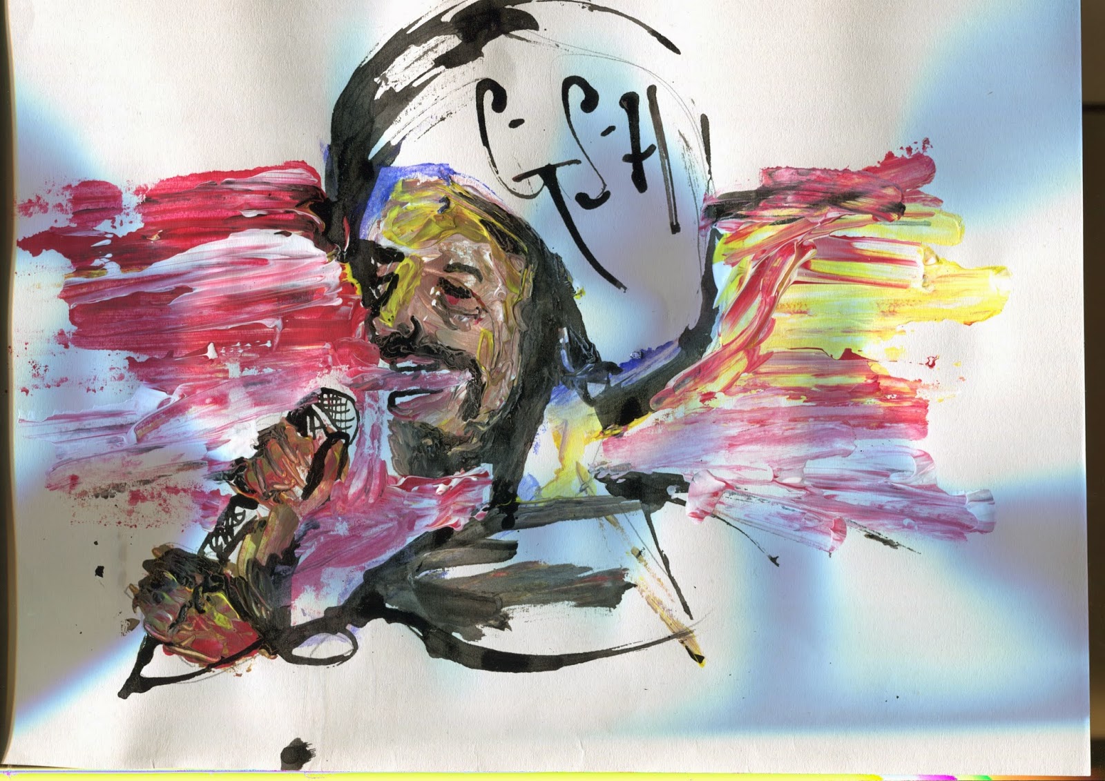
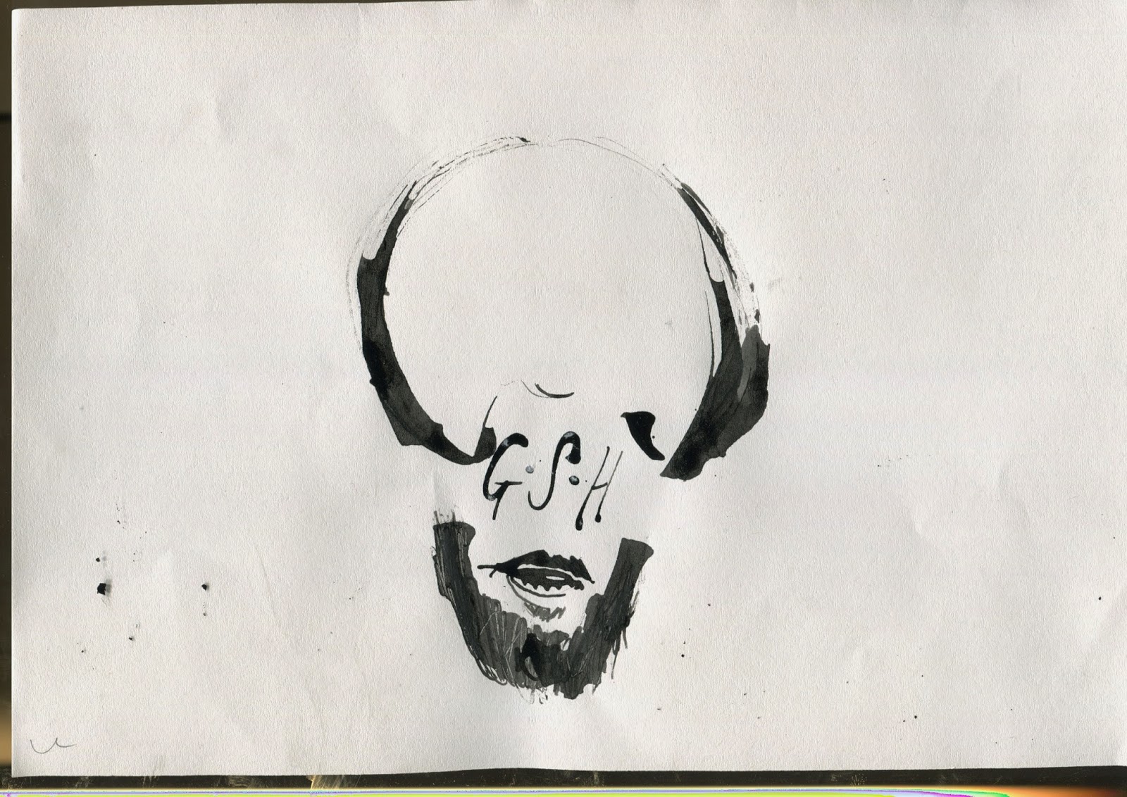
The main aspects I firstly took was much me dedicated approach to line and the weight of it. I think that's more than evident in my work from the start but looking back you can see the development of it and how the usage has adapted to alternative aspects of work. Also from the offset, from our first lesson in vis. l I really enjoyed getting into the habit of drawing something over and over a little different. Like going back to my sketchbook and producing 4 pages of weird bat people, or 8 pages of nothing but octopus tentacles with different tools and media again I think this employs continently in work; I rarely if ever can draw something once. There's too much potential in illustration to do something once.

2. Which principles/ theories of image making have you found most valuable during this module and how effectively do you think you are employing these within your own practice?
It's quite hard to choose one theory, it might sound bad but they've all blended into practise and un-concious thought of making pictures; I know visual language has taught me these things but from drilling it in; it all just happens now. The shining beacon for me however would have to be depth of field within composition. If it was just adding a simple horizon line behind a figure or if it's placing 8  shapes around each other in a complimentary manor. Composition and depth of field will constantly be an on going battle of what works and how I want it to work.

3. What strengths can you identify within your Visual Language submission you capitalise on these?
My biggest assets in this submission; in my opinion is the enjoyment I get from repeating ideas; the speed I put them out and the loose identity my work has. Now my work has always been loose for the most part and I've always been able to work quick but now because of this module I can use it to potential. I'm no longer scribbling on a page to make it look like I'm doing a lot of work. I'm making quick; important decisions to create more possibles for myself.

4. What areas for development can you identify within your Visual Language submission and how will you address these in the future?
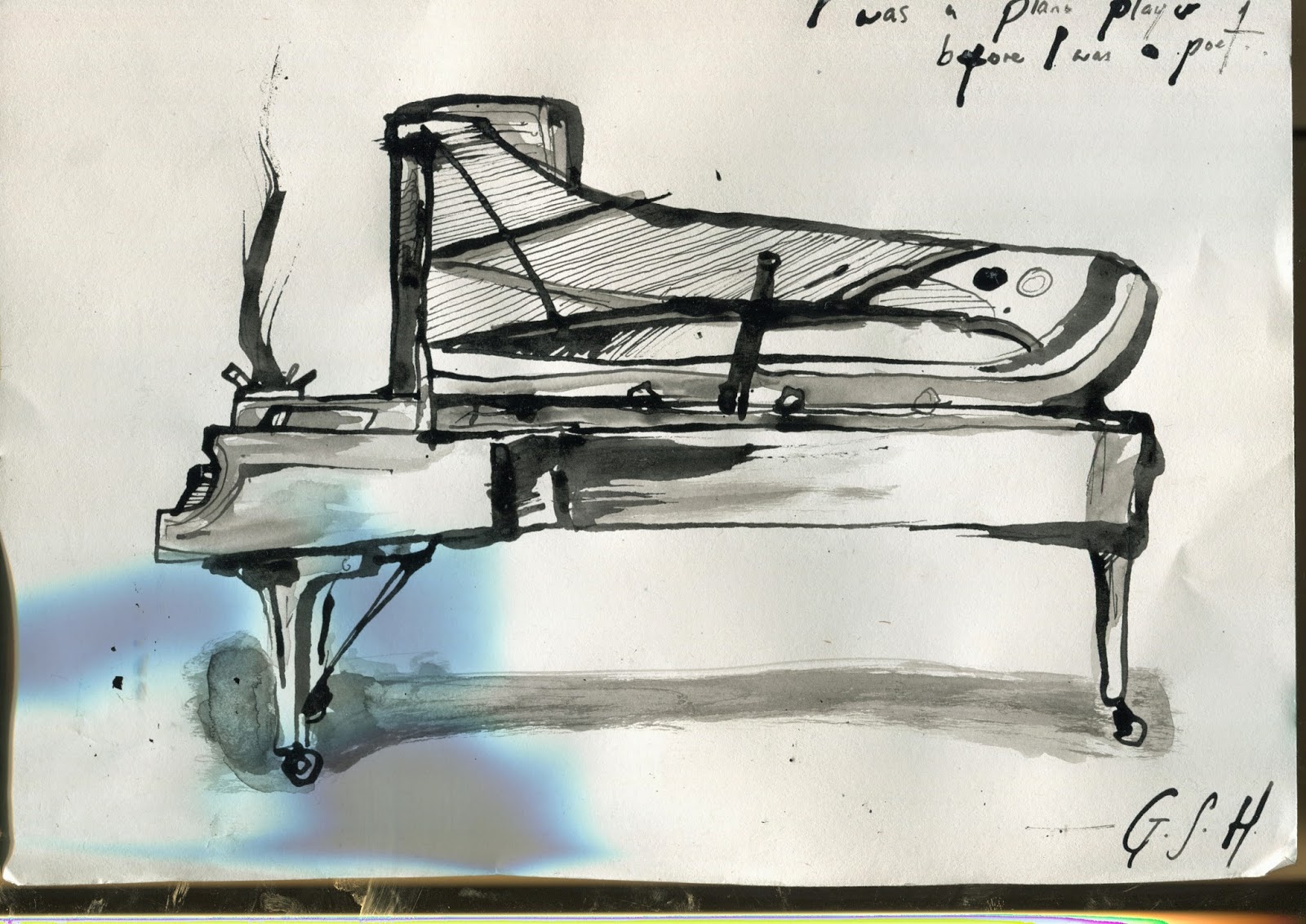
Lots, lots of areas for development but I'd write too much. Time taken on pieces; I sometimes really on the speed I work and then don't usually spend more than an hour or so on the final resolution which is sometimes OK but I need to remember to mix it up and sometimes spend a lot longer on something and surprise myself. Remember other skills, for example; I tend to always go to use ink, it's what I know works well with me. Then I'll remember how much I love collage when I've finished something and I'll get annoyed at what could have been. Passion and drive; some days I don't want to get out of bed. Never mind create something, I need to remind myself why I'm here and why I love it. 

5. In what way has this module informed how you de-construct and analyse artwork (whether your own or that of contemporary practitioners?
It has allowed me to look past the image and see what thought and process has gone into creating a piece of art which in turn opens your mind on how you can  do something similar; something better. From creating line of sight to learning about value and colour. All equally important. I wouldn't understand it if It wasn't for the tasks set to understand handouts. By employing the tactics it helps you when seeing it others work and your own.

6.How would you grade yourself on the following areas:
5= excellent, 4 = very good, 3 = good, 2 = average, 1 = poor
Attendance:  4
Punctuality:   5
Motivation:    3
Commitment:  3
Quantity of work produced: 4
Quality of work produced: 3
Contribution: 3


Peace.


Vis L.

Colour