Wednesday, 21 January 2015

New animation stills.


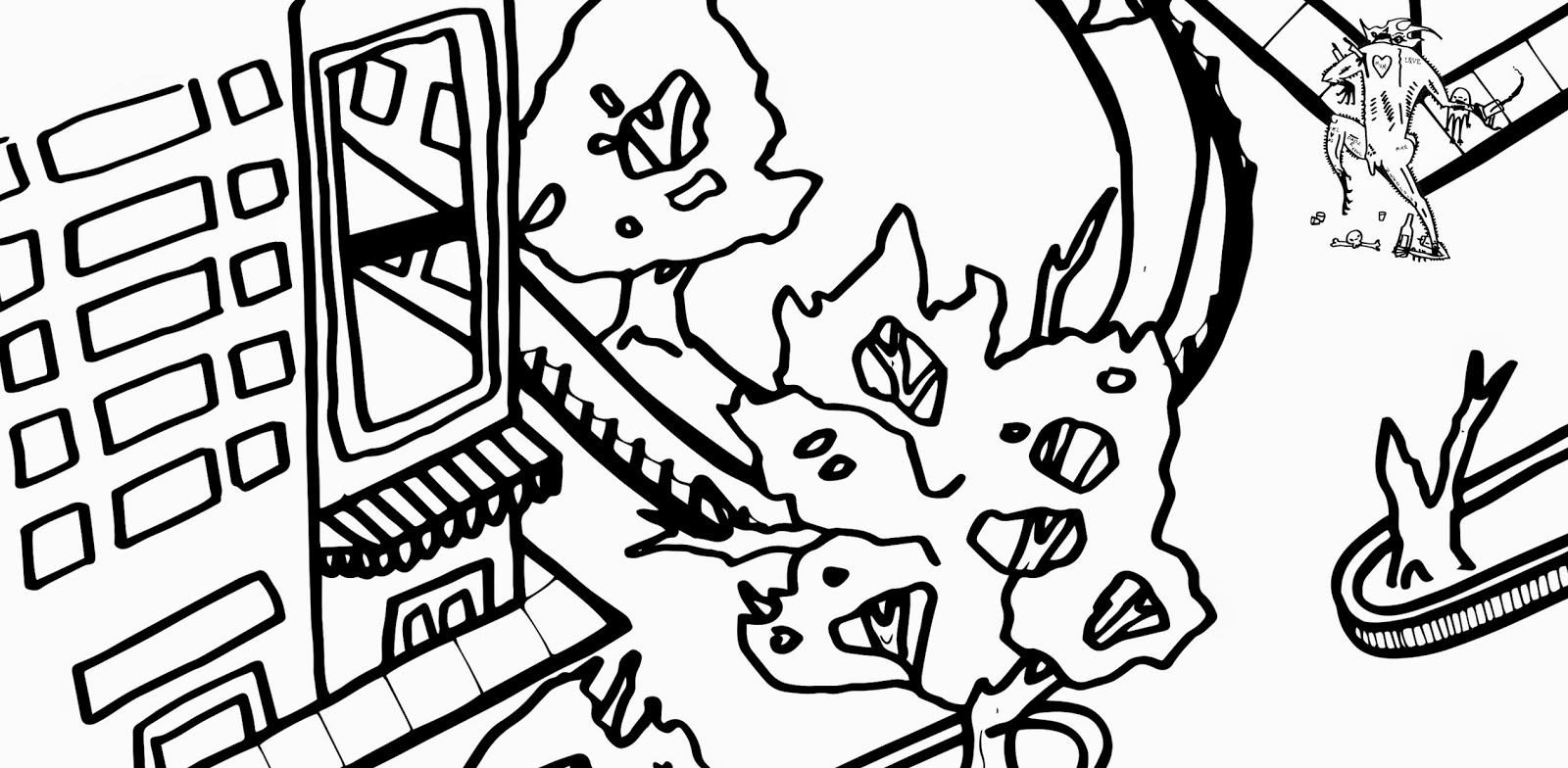
These are the final looking images of my stop motion animations, I created the whole image by drawing them bit by bit then taking a photo each time I drew a little then put them all together to create the effect of movement. 


As you can see there were two options for which 'back drop' I wanted to use, I chose the darken more murky one in the end because I believe it reflected the feelings and purpose of my animation more than the brighter colours.


How was it done.
I made a very D.I.Y rostrum, It got the job done.


Writing.

Nothing big or fancy here. just giving an myself an idea of how hand drawn step by step text looks.

RE-VAMP

Ok ok ok, I've revamped again. I've been stressing and pulling my hair out and none of these ideas are working. None. So i've gone back to basics. Back to where it started. My first ever look at Murakami were just certain quotes picked form books. That's what interested me. Interpretation of certain quotes. Everything after that is nonsense. So my new plan, just draw out and animate those quotes. An then whatever comes to my head from them. I know it's basic and overdone but this is where I'm at. Too me it makes sense and it's manageable..

Next set colour ways


I had quite a few set of these (8 each) so it was easy to see where some had worked and some hadn't. Again with ti being smaller the paint was a lot smoother and took a lot easier which made the whole process much less stressful and more enjoyable. The only concern is that the prints on good stock aren't as clean as I could have hoped and annoyingly on the cheap newsprint the prints and so much cleaner so I needed to find a better paint balance I think.

Next set


Next go round was creating my other 5 prints from characters I had made already. This print was a lot easier in that I could do one screen and have 5 separate prints from when it was all cut down. I also was a smaller screen which for me meant the pull was much smoother and cleaner and made the paint take much easier and cleaner to the paper. Absolutely no problems with this one. Hopefully will be just as easier in next colour process.

Colour matching


Seen as my black pulls weren't working as well I washed my screen to attempt it again. This time trying to line it up with my previous colour attempts. I was most worried about not being able line them up properly but honestly, that was the easiest part. It was still the black not pulling through properly so much so was the trouble it never got fully resolved, It hugely affected my final prints for this image and really bummed me out.

There were many attempts, alas..


Screen tests 2


This session didn't go half as well as the first. In fact it just went awful. The pulls weren't coming through right. My screen kept getting blocked towards the bottom. I mixed it with more medium but still no looking, It skipped the bottom of my screen every time. I kept trying but to no avail. Bad day.

Turns out it could be due to the fact it was suck a large smooth area of black and that my screen was a bit old damaged and partly blocked since it was a repeat occurrence even after re-exposing my screen.

Screen tests


 Today was my first real day back in screen printing for a while, After taking ages to get my final image ready I finally exposed it and did the first colour-way today. It went a lot better than expected, I'm always really worried about screenprinting until I start doing it them I remember I'm actually not bad at it. After a few pulls and messing with amounts of paint I got a good few yellow colour ways down,

WHY YELLOW?!
 I'm aware I had all the black red and white vibe going and backed with research however yellow just felt right. It's less intense to look at from a far and I think adds the juxtaposition that I wanted from my image in the first place.


Wednesday, 7 January 2015

Test 2


Since I scrapped my old idea I decided to story board some more ideas and then try it out on my phone again. The concept seems to work as a basic idea and I much prefer the look of a cut-out and stop-frame as opposed to the drawn in stop-frame.


Test


I've got a an app on my phone that allows you to make stop motion animation and I've found it really usual to use when I have an idea that I'm not sure about. It allows me to test out ideas quickly too see if they work so i'm not wasting time on bigger projects where the end result falls flat.

Above are examples of a concept I had I wasn't sure about so I story bored it then used my phone to do a quick take to see how it could work.

I'm not saying these are good, even passable animations but for me its a more advanced version of thumb nailing that helps me get me ideas together.

This idea was unsuccessful, pacing aside I just don't like how it looks with ink, So I might go back to cutout models.


Animation spot light:

My house mate showed me this. It's really really cool. Awesome animation and mood building and it's just really up my street. Above and beyond anything I can do but I'm sure it'll help somewhere down the line. I much prefer watching animations than actually creating them.

Monday, 5 January 2015

Practice


Animations been my biggest worry and hardest task to get around too date and it's for that reason I've not really tried my hardest or come to grips with it yet. So this is where I need to get a lot of work done in a short amount of time.


Animation of today:
Does this count? I mean it is stop frame. It's not something I think will really effect my progress of work but I just thought it was a really neat way of using stop motion. That's about it really.


Reasoning


I may have spent too long on focusing on the digital side of this and now realizing i'm rapidly running out of time to actually get this printed, guess we'll see how this all works out. I won't lie I'm not all too fond of this especially how long it taken me to get all this 'right' At first I was going to choose bright neon colours to screen-print with but I went for Red/Black/White because It works and it's a staple of horror movie posters which is always a good thing.


Also as an added note, the author I was looking at Murakami a lot of his book covers have a very similiar colour scheme. Including 1Q84 which was the main influence of my conceptual design or my work.


Colour process.


Again making this digital has made my life so much easier when it came to putting everything together and colouring it. Now my annoyance in myself before I really understood screen-printing I changed my style of working to what I thought would work better with screen-printing however I now know that I could of kept my usual way of working and i imagined I would of enjoyed it a lot more but we're here and I guess I'll know for next time.


Town revisited


After having a quick peer review with some people and asking what they thought so far and general thoughts was that the town I had originally was quite cluttered and adding the characters was making it more cluttered. Now even though I'm going for a somewhat crazy; anarchic esc looking cluttered isn't exactly what I was going for.

After some thinking and planning I remembered we had Drew Millward in to speak to us not long ago so i thought i'd look at some of this work, see if it helped at all.


Now i'll admit at first glance it looks like there's no way this will help me make things less cluttered and crazy but then I found this piece by Drew for a band called Phish.
Again at first glace it looks like busy but when I really looked and stripped it right back and was able to see a composition that would really help me so In end taking what I'd already learnt and this piece by Drew I've got my final composition for the town.


Cityscape


After going through a few sketches and designs this is the design I've settled on, I've started adding characters into it by scanning them in, making them into vectors on Illustrator making it much easier for scaling and colour them when placing them into the city-scape.

Screen printing attempt.

After many many attempts at the first colour-way I came to the conclusion that the far left of my screen was either blocked of not exposed properly since no matter what I did (30+ attempts) the far left design was always a partial exposure and faint. Back to the drawing board.


Tuesday, 2 December 2014

P.P

Colour Splits.


Just to show an example of colour splits. If i print them both off digitally and expose them both on one screen I can create a two colour print. The bigger the screen the better because that way I would print all designs at once then cut them out myself instead of continuously re-exposing screens.

Split:

Split:


P.P


These are the smaller (A5) screenprint ideas i've been working on. Note these are only digital tests designed to give me some scope on what the end product may end up looking like. They're a little bit cleaner than I'd like, doesn't feel like my usual practice at all. It's good to try new things but i'm still shaky on the outcome


Plan

P.P
  • Decide on a simply cityscape, go with it
  • Choose 4-6 smaller characters to go around the print (2 colour print)
  • Use photoshop to scale everything properly then print it off digitally
  • Expose screens and start screen printing them.
  • 1 A2 two colour screenprint
  • 4-6 A5 two colour print
M.P
  • Keep it very simple
  • Choose mundane 'breaking points'
  • minimal movement
  • focus more on sound
  • find shortcuts for yourself
  • 3 stings showing everyday breaking points 
  • Equilibrium - Disequilibrium - Re-equilibrium


Animator currently looking at: 
Felix Colgrave, I think is my favorite animator ever. Which is a big thing to say considering he's not exactly well known or even really out of collage (America) everything he does just really resonates with me, It's just the right mix of weird but skillful that hits home with me. It's strange I find myself most drawn to digital animators when that's not at all like my practice, nor do I want it too be.

Surgery.

Questions - Printed Pictures

  1. Text, how can it be used?
    Text can be used as an image, not with an image. It should help create the image however it's not really relevant for you, and the amount of ideas you've already got going you're going to over complicated things for yourself.
  2. Over-Complicating things for myself?
    The scope of what you want to do is doable but there's still a lot to do. You're worry too much about the contextual side of things and constantly tweeking too much. You've already got a large body of work to go from, don't add more choices to that.
  3. Colours?
    Colours are important in this and your idea for having welcoming colours to a unwelcoming scene work well but it's something you're just going to have to do in order to see how it all works out
Questions - Moving Pictures
  1. How refined does it have to be?
    Refined as a finished product, fully. Don't think of that as it has to be a super crisy and clean animation. Just running with the very basic you can. Make it easy for yourself. Super 
  2. How relevant to the author?
    basic/minimal; almost abstract in a sense will work well with the ideas you're working with.
    As long as you show the journey you've made and why you've got there; as long as it was directly inspired by an authors text then it will be fine.
  3. Literal or inspired by?
    Inspired by

    Summary:
    Ideas are there, almost too many. Over thinking the concepts behind it all. You've got lots of ideas and you're trying to add too much too it. It can always be something you can come back too but as of now you're running out of time and the best thing for you to do now it make a plan and then just go do it.

Tuesday, 25 November 2014

P.P City

I'm aware the hardest task for me will be developing the city in which my charaacters will be expressing themselves. It's not something I usually do nevermind take on such a big job of it but I need to start somewhere. Here are examples of ideas of cities; views; angles and illustrations I've been looking at to give myself ideas.