Monday, 23 March 2015

Boston Manor

I did what Henry asked, Did a few quick drawings, In all black since they only wanted 1 colour. An I sent them across to Henry too choose one then I'd do a final version of it for him....It was never going to be that easy.


I got a reply saying he loved all of them and so did the rest of the band but it wasn't really what they had in mind. An upon asking what they did have In mind the response was 'I dunno man, Just like the stuff that you do'

Back we go...

Boston Manor


Boston Manor are a band from my home town, they're doing the rounds and picking up quite a bit of a following and an interest at the moment. Henry Cox, the lead singer got in touch with me and asked if I could design them a t-shirt. I said sure.

I know Henry pretty well, so I already knew my client and I wasn't about to go all corporate on him with what I charge and how I work, I just asked what he wanted and he said 'Anything man, Just do whatever' Which was awesome. I got right to work.


Thursday, 12 March 2015

BOARDS

My boards kept the same colour scheme through out, while showing the diversity of my product and the ease in which is transfers to different mediums to effect kids (11) and Dads of that generation. I think for a first go round they're not bad. I'll see what the crit brings and if my ideas are working how I think they are.


Crit main points.

The good
 
  • Good character design
  • Well thought out execution of style
  • Good colour scheme
  • Timeline idea is nice
  • Lots of different platforms looked at
The bad
  • More text on boards
  • Explain the armor maybe
  • Tagline maybe?
  • Explanations on statistics, why kids need to read
  • Maybe two timelines for a boy and a girl monster
I agree with all those points accept the last one, I think the monsters and pretty genderless and to make a female monster means there need to be an end point (grown up monster) which would in turn mean I'd have to draw a Mum monster. It's not the work load that bothers me about drawing another it's that the brief does say it's focusing on Dads and adding a Mummy monster, in my opinion would take away from that.


Boards and Crit

We were asked to make 3-5 proposal boards to show off our products and them come along to a crit. Told that there's 'No right or wrong way to do'' but that aint true, There's always a wrong way to do something, it's usually the fun way. So I decided to do some research. Now usually I'd like to do something a bit weird or even wrong because It goes with my practice but this isn't like my usual work so i'll keep it dialed down for now


We have to do these for an upcoming crit.

KIDS ARE THE FUTURE


I decided that this dude wasn't enough. For me anyone. I wanted to add a little more too it. Give it a bit more narrative. So after so brain storming you get this:


Now you have more a timeline. One of the main arguments 'GET ON READ ON' have is that if a Dad reads to child just 10minutes a day It drastically improves there reading ability and it's proven children who develop this early on get into higher and further education. So I ran with that and with the knight thing.  So far so good.


MONSTER

After doing some research on artists and takin' inspiration from my own life and memories and of course not forgetting all the rules, I've got this going down at the moment.


Does the phrase 'Little monsters' spring too mind?
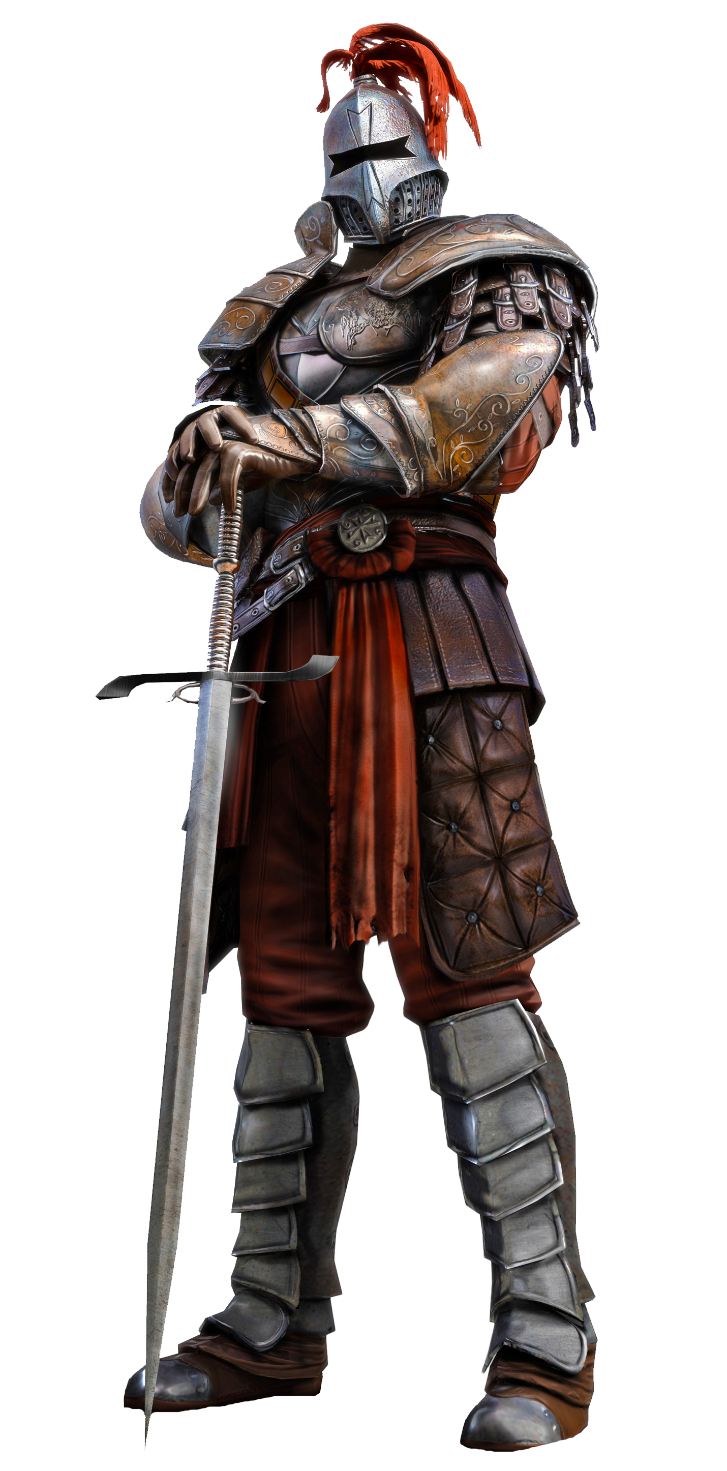
And The 'Dad' is wearing armor, because ya know. He's his kids hero. he's good like that.

REMEMBER

To say it's to help kids improve. An its meant to be a fun; interesting brief. It sure has a lot of rules that make it a lot like hard work, and overall a much more boring breif. BOOOO


See what I'm saying?


Monster Dads

It's a bit of a risk (maybe) well a risk if i'm planning on winning this. I wanted to draw my usual monster dudes, but maybe less 'Ill rip your face off' I'm just going to make them look a lot nicer haha. I think it'll work. Kids like friendly monsters (Monsters Inc) and maybe It will appeal a lil bit more to dads and a really cute character asking them to read.

Artistic style

The main issue that I knew would arise is my actual practice. It's not my strong point to do something aimed at families, children especially however I still wanted to do this without having to change my practice. It was about finding a way my practice could work differently and not just changing my work so it's unrecognizable to suit a brief. 

So i decided to look for children's book illustrators, mainly ones that work in a similar way than mine. Then it hit me and I felt so stupid. Quentin Blake, when you see it on paper our 'styles' aren't exactly worlds away.


Knights

I've been racking my brain, on how I should go about doing this breif, It's a bit of a challenge since it's not too my usual taste. I had a bit of a brainstorm and thought about knights. Most young sons will see their father as some type of hero type and someone to be looked up too and what kind of Dad wouldn't want to be seen as a knight by his family.


Save the children


A few starting points for perspective and reference of family members, mainly Dads or male role models reading the children, This was simply to give me an idea of sizes, positions and a strong starting point for me just to get the ball rolling.

Only rough starting points but, giving me helps on positions and what works best, trying to decide which postion looks more supportive and 'fun' for the children and the Dads 

Save the Children

  • Focus on Dads
  • Looks at father/children relationship
  • Do visual research
  • Develop into own style
  • Make this shit work
  • Make sure to check requirements. 

Wednesday, 4 March 2015

Proposal

BA (Hons.) Illustration   LEVEL 05

Module Code:OUIL505    2014/15    Module Title  :ILLUSTRATION 2: Applied Illustration

STUDIO BRIEF 1: Project Proposal 

Project Rationale

What are you proposing to do? (Product, Range & Distribution)
Create a range of products that are all finalized on none traditional canvas’ e.g Plates; cuboards; walls; shoes etc etc.

What do you want achieve?
I want to put my work in places where It wouldn’t normally be viewed and by people who wouldn’t normally do it on objects you wouldn’t usually see It on. I want to create my own audience by where I place things. Not waiting for a gallery as It were however this is no way a movement against gallerys or in a protest that my own should be in one

What do you want learn from doing it?
How different media and products react and work to non-traditional canvas’ and how people react to work that is in the same form

THEMES / SUBJECTS
What Themes/Subjects will form the content of your work for this module? This should include Theoretical and non- creative based content and concerns. This section should identify your consideration of the social, cultural, ethical and creative concerns of contemporary practice

GENERAL THEMES:
Social and political happenings in citys and around the world. Monsters in the real world.

SPECIFIC SUBJECTS:
Violence; Injustice; Wrong doing.

PRACTICAL & CONCEPTUAL APPLICATION
What areas of Illustration do you intend to investigate in relation to the practical and conceptual, production / distribution of work in response to selected briefs.

SPECIFIC DISCIPLINARY AREA:
N/A. This is about exploration for me.

AUDIENCE/CONTEXTS:
Audience is defined by where my work goes, as opposed to who would want to see it

PRODUCTION / Distribution Methods:
Guerilla techniques

CONTEXTUAL REFERENCES
Identify areas of professional/creative practices that will inform the contextualization of the work that you produce. This should include specific illustrators, studios, practitioner’s and products as well as broader creative disciplines and methods of Production / Distribution.

ILLUSTRATORS / DESIGNERS / STUDIOS: Neckface; Ralph Steadman, Eterno, Cleon Peterson, Ron Wells,


Tuesday, 3 March 2015

Thoughts

The main discrepancy I found with making the two images on the plates, wasn't actually what I thought it would be. The media I used worked differently but not really too far from what I expected. The worst part was actually taking photos. Plates are shiny; catch light easy; don't angle right; don't stand up by themselves. So effectively I'm going to look into getting the work for this project professionally studio shot as-well as getting plate stands and anything else I might need to make it look better

Failed Photos:

Plate two

After the first one, An using the marker I decided to draw on a bigger plate and use the marker and a fine liner to get a different weight of line since the heavier marker couldn't pull off certain lines I waned to achieve on the first page. It was really different drawing on ceramic, It takes the ink well and it's really smooth but there's certain weights of line you can't achieve like you can on paper or canvas.


'If I drink and smoke for long enough, somethings bound to happen....'

I like these as practices and a quick idea, It's also good to find out working with a different canvas hasn't effected how I work quickly and hasn't been detrimental to the way I create images.

Plate one.

I can only mock things up for so long, I need to get to grips with the materials I'm working with. I got a small plate and a used some of these new TOUCH-Twin Markers I've got to see what it was like. I started by planning to do a few sketches in my book first to get he right idea but the first sketch turned out fine, Didn't take much tweaking.


'EATING MY VEG, IS LIKE LOOKING AT YOU. I DON'T LIKE YOU...'


Messing around

Decided since I've picked up a few more photoshop skills that I never had, I can make this whole trial and error part and little bit smoother. So I threw together some of my designs onto a nice photo of a plate I found, Just to give myself an idea of how this looks; composition and the likes.

Off paper

We have chalk in our house among lots of other pens and lots of things that are just lying around so I tend to draw things on things, I usually forget to snap a picture before someone washes it away but i've got a few examples. It's nothing special but it's interesting to show some off paper examples. 


It most important thing to note is that when off paper, the tool your using is really important and different. Some surfaces don't well so certain drawing tools, Some will even damage them and the line quality so completely different on a was as opposed to on paper.